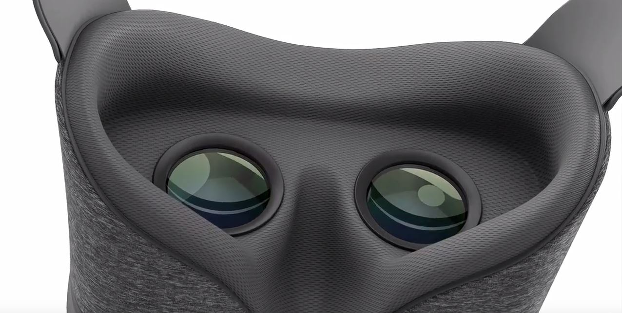
Today, Google finally pulled the curtain back on its mysterious virtual reality headset: Daydream View. Since its announcement at Google I/O earlier in the year, Daydream has been positioned as a potential usurper to the mobile VR throne currently occupied by Samsung and Oculus with Gear VR. However, much like a certain wonderful wizard that once also hid behind a curtain, View, in its reality, has potential but falls somewhat short of expectations.
Design
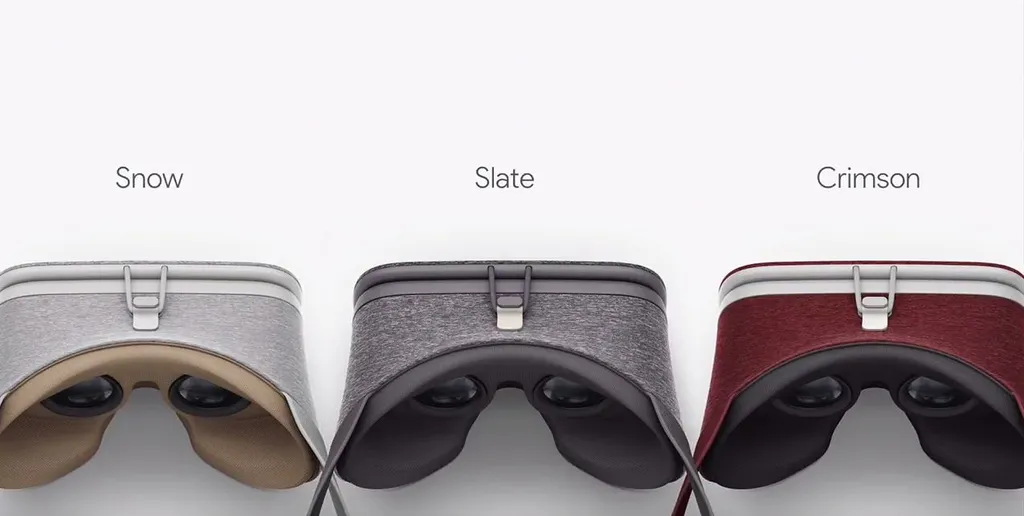
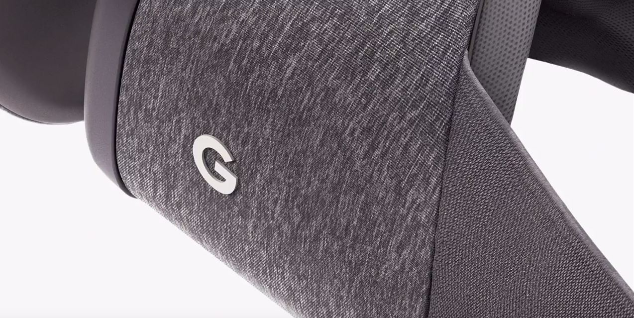
Let’s start with the good. From a design standpoint, View is a breath of fresh air. In an industry dominated by plastics and foam, View’s cushy, fabric-focused aesthetic is just the right kind of different.
In his portion of today’s keynote address in San Francisco, Google’s VP of VR, Clay Bavor stated that when he and his team were conceiving View’s design they “wanted to think about what you actually wear…your clothes” and the soft cloth of the device backs up that sentiment perfectly.
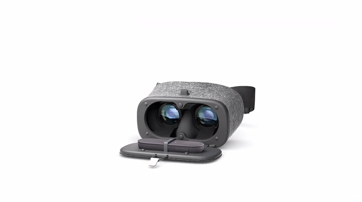
The View I tried featured a single head strap that wraps around the back of your skull. No over-the-head strap was found in either the sample unit or promotional materials. The smartphone, which actually powers the VR experiences, pops into a fold-out panel secured at the top with a small length of cord. There are no snaps, buckles, or locks on this device and the whole thing feels like more of a fancy purse for your phone than a piece of cutting edge technology.
The only phone currently compatible with View is the upcoming Google Pixel (also announced today) but Bavor did state that more working handsets “are coming soon from our partners.”
Comfort & Fit
Ergonomics are probably View’s most glaring weakness. My experience with the headset is that it felt a bit too small and too lose on my face. The absence of a top head strap was felt strongly and made me hesitant to move my head too much during demos. Simultaneously, the weight of the phone itself made the whole headset feel like it was always on the cusp of sliding down my face. The only way to combat this was to tighten the strap a few notches past comfortable and even then the experience was not ideal.
This last problem was further compounded by the fact that the facial interface of the View features a sort of angled slope that keeps the headset from pressing too hard on your nose, but also makes the entire thing feel a bit less secure in general.
It is worth noting, however, that other reporters for this site found the fit to be very comfortable, especially for glasses wearers. Also, the unique materials themselves were much lighter, and more comfortable against the skin than other mobile VR devices.
Performance
Comfort issues aside, the View performs beautifully. The device simply starts running once the headset and the Pixel recognize one another.
The home screen is fairly standard and features a bright, green, outdoor sort of setting that feels inviting and looks stunning. I saw two rows of eight or so cons when I put on the headset, most of which were pre-loaded demos for the launch event. Impressively, each icon for an experience had its own 3D thumbnail. Demos included several games, a Harry Potter experience tying into the upcoming film Fantastic Beasts and Where To Find Them, a dedicated YouTube app and a Street View application.
I tried several of these including Harry Potter, YouTube and a sort of tilt-table mini-game that used the View’s innovative controller (more on that later). All these experiences looked crisp and as high-resolution as anything else we’ve seen in the mobile VR space. YouTube ran particularly well and looked amazing for a 360 video on the device.
Head tracking, app selection, and overall performance inside View were all top notch. Demos loaded at lightning speeds and I didn’t detect so much as a single dropped frame in any of my experiences.
The Remote
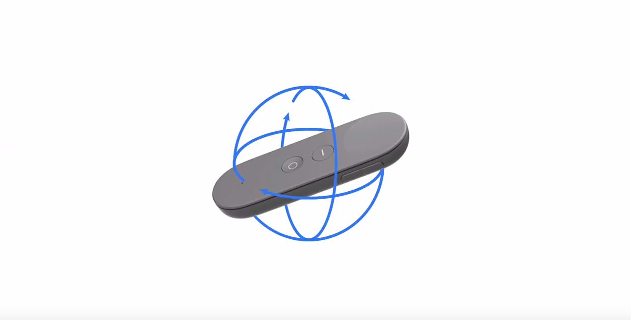
The remote is View’s ace in the hole. It looks very similar to an Apple TV or Oculus remote but with a bit more heft to it. The remote contains a variety of sensors that allow for motion tracking on a variety of different planes including horizontal, vertical, and tilt.
All selections and general controls for View are done with the remote which makes it an absolutely essential piece of the system. This means that losing it would be a very bad thing. Luckily, Google thought to include a special holster for the remote within the headset itself. You’ll still want to be extra careful not to let it out of your sight.
The remote performs decently but there is the tiniest bit of detectable lag on it. It also occasionally gets confused and needs its orientation reset (a quick fix with a two second hold of the menu button). The potential applications for this remote are many and varied and we will need to wait and see if this tiny gray bit of plastic can become a powerful mortar in the ongoing battle between mobile VR companies.
Conclusion: Daydreaming About The Future
View is certainly not a revolutionary device in its current state. It has a few innovations in style and materials but at this point its form factor, while comfortable, may be a bit too flimsy to be the new king of the mountain.
The remote may be a difference maker but at this point it’s too early to tell. What will truly make the difference, however, is how well Google is able to leverage its many spheres of influence (YouTube, maps, voice, etc.) in order to optimize View’s viability in the marketplace.
A new challenger has entered the ring. Now let’s see if he can put the champ on his back.

