One of the big challenges with VR storytelling lies within the constraints on camera movement forced upon us by this tiny detail called simulator sickness. Quick zoom in to focus on a detail – nope, not possible, you can’t zoom in VR. Nice dolly shot moving around the scene – be careful or the viewer might have a look at what he had for breakfast instead of comfortably watching your experience.
This doesn’t mean that camera movement during an experience is impossible, it absolutely is and can be very nice effect also in VR (“Evolution of Verse” by VRSE is a nice example). However, those dolly shots have to be tested and refined extensively with many testers to ensure a comfortable viewing experience – while the safest bet is not having continuous camera movement at all. Needless to say that the former isn’t very scalable while the latter is simply unsatisfactory from an artistic point of view.
 A background in cognitive science and VR psychology research, Daniel Sproll is working as a VR UX specialist at RE’FLEKT, designing interactions for all sorts of non-gaming VR applications from data visualisation to interactive 360° video. He is also an active member of the growing european VR scene and was a member of the Oculus Mobile VR Jam team Colosse. You can follow him on Twitter @left_big_toe.
When developing Colosse we we sat down and looked at the underlying perceptual causes of motion sickness and see if there was a possibility to design a robust, scalable method of allowing (even wild) camera movement without causing sickness. And so the ‘Limbo’ was born.
Motion sickness is a problem caused by conflicting sensory cues: your visual system tells you, you move, but your sense of balance says no. This conflict triggers some instincts wired deeply into our mammal brains: our body thinks it got poisoned and switches on the nausea switches, trying you to stop and maybe even to get rid of what you just ate.
So in short, moving people only through the virtual space is bad but we still had a desire to do some sweet moving shots. Well, if the prophet can’t go to the mountain, the mountain has to come to the prophet. In order to avoid or at least alleviate this effect we decided to try flipping the perception of the viewer: instead of you moving around the scene, the scene is moving around you.
The idea is not entirely new, but is built upon experiments with visual reference frames attached to the torso of the user as presented in a talk by Tom Forsyth from Oculus.
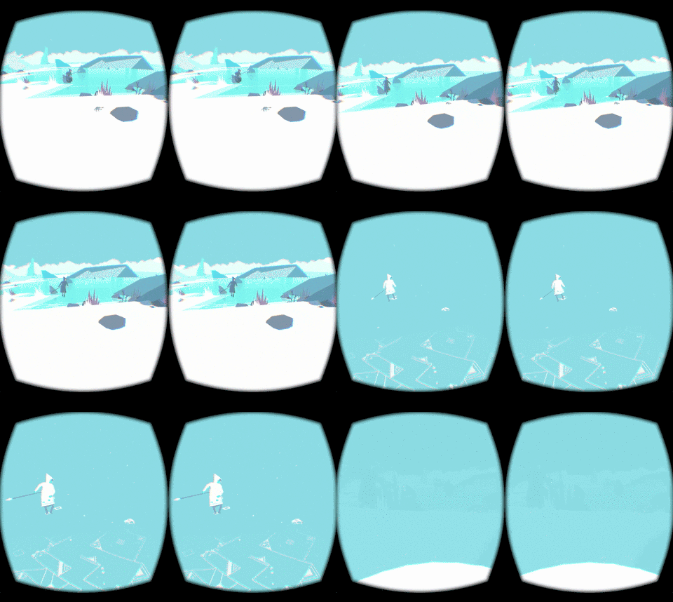
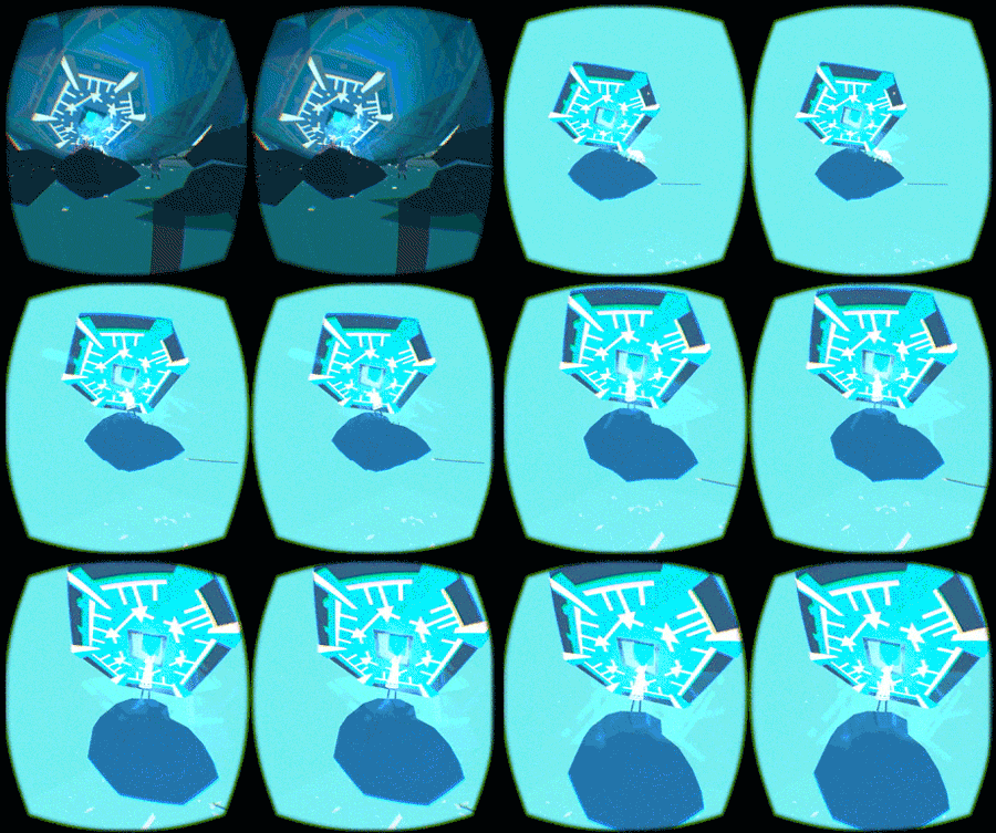
But how do you flip someone’s perception? First thing to do is counteracting an effect called vection, the illusion of movement based on solely visual cues. Know that feeling when you sit in a train and think your train started moving but it was actually the train beside that was rolling away? That’s vection. The biggest trigger of vection is optical flow: a lot of things within your visual field moving in the same direction. Thus, to reduce visual flow, we had to get rid of most of the scene. Fading out all but the most important elements to minimize visual flow during camera movement to avoid vection.
To further safeguard the viewer against any motion sickness we pulled another trick out of our sleeves: not only avoid vection by removing things from the scene but also add a fixed frame of reference centered to the torso of the user. Within this reference frame virtual and physical motion are in sync. No conflicts makes your lizard brain happy and keeps your stomach calm.
We used two elements to create this reference frame: a subtle particle effect and a ground plane far below the user. Using short lived particles we were able to create this artificial reference frame without distracting the user.

During our first experiments it turned out our need to remove large parts of the scene could be a feature instead of a bug: it created an interesting effect of focus that can be used for storytelling itself. For Colosse we used the Limbo during a moment when our main character himself has a moment of extreme focus and loses awareness of everything around him. The switch into the limbo mode creates a similar situation for the user, creating a connection to how the hunter perceives the situation.
While working on Colosse we experimented with the use of the limbo for different shots, for example the crab scene in the intro and the scene where the hunter discovers the cave paintings. In the end we decided to only use it for the key scene where the hunter goes for the Colosses’ stone to not overload the short experience.

I think the limbo mode can be an interesting, flexible approach to enable more dynamic camera movement within VR. If tied into the experience in a meaningful way it can also be used as a storytelling tool, directing the user’s attention. To enable more people to play around with it, I compiled an example scene that contains some basic assets and scripts as well as some example camera movements to play around with: https://github.com/leftbigtoe/LimboExample
Check it out and play around with it, I’d love to see what you guys come up with!


