I’d love to tell you that Blind’s infuriating puzzles are frustrating for the right reasons, but I can’t. Tiny Bull Studios’ efforts to put you in the shoes of a blind person, giving you a taste of what life is like without sight are thoughtfully delivered and will stay with me for long after this review. Sadly, it’s the more traditional design elements that make Blind such a chore to play.
Simply put, Blind’s brand of puzzling, which sees you trying to escape captivity in an enormous mansion, is the antithesis of Torn, a game that favored simple challenges in order to keep the pace flowing. Tiny Bull has gone to great lengths to introduce a varied set of puzzles, but solutions are often so specific that I felt like I was hitting a roadblock every few minutes.
Take one of the game’s earliest puzzles, in which you need to find a key hidden in a library. It’s not the game’s monochrome color scheme that makes the search so draining, it’s the obscurity of the eventual solution. A grandfather clock embedded in the bookcase seems like the obvious keeper of the key, but it’s completely uninteractive.
It wasn’t until after 30 minutes of exhaustive searching that I discovered I had to, in fact, click a footstall sitting a meter or so away to watch it automatically slide over to the clock. I couldn’t use it unless I was on the stool, even though I could reach everything just fine on the floor. Then I had to put the time in the correct place according to an audio diary. When that didn’t work, it took me yet more time to discover the phrase “nearly quarter past” in a completely separate entry. Puzzles are routinely bloated in this way.
Later on, though, I had to retrieve an item stuck at the top of a fountain and yet I couldn’t use the stepladder sitting in the next room. There’s not much consistency to Blind’s world because you have to play by its rules, and those rules often feel like they’re known only to the developer. There are several more instances like this and, to be frank, I ran out of patience long before the game’s ending neared. A better hint system could have been a real game changer here, as the mystery at the center of Blind had me engaged with its characters throughout and many people won’t get to experience all of it.
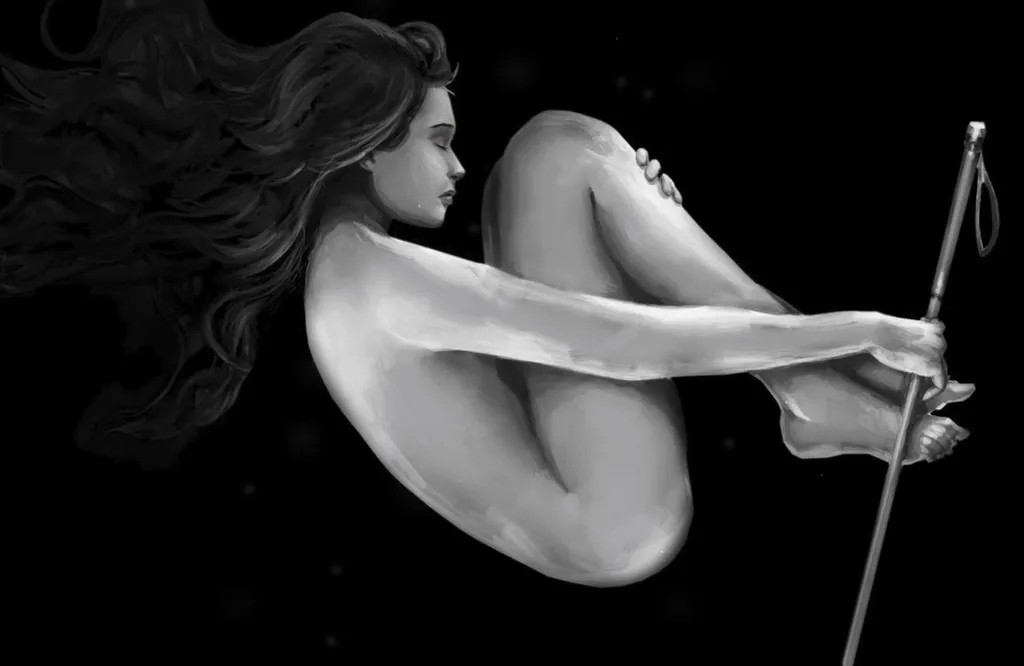
It’s a real shame, as Blind’s core premise of experiencing life through the eyes of someone that can’t see is well implemented. Early only you’re given a white cane that helps navigate environments and it gives the game a good deal of authenticity. Small taps will create echoes that visualize a tiny space around you though harder swipes will reveal a much wider look at the risk of overwhelming your senses. It’s a fairly straightforward representation of what I’m sure is a much more complex condition in reality, but its simplicity also helps staves off a lot (though not all) of the potential monotony.
You summon the stick with a pull of the trigger, so it never gets in your way and it reacts with impressive replication depending on the type of material you strike. Tapping a carpeted floor produces a muffled noise, for example, whilst striking stone gives you a much clearer image. Blind is a much better game when leaves you to simply explore using this novel mechanic.
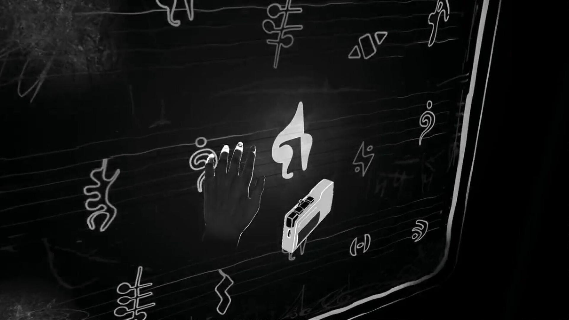
There has to be a better application for this foundation than a puzzle game, though. I can’t imagine how tough it was to find the balance between keeping players engaged in this mechanic and not making it too much of a barrier. To see it paired with a genre that’s notorious for testing player’s patience is bemusing to say the least, especially when a large number of puzzles aren’t really exploring its hook in any meaningful way. What does navigating a ball through a maze have to do with being blind? Why is a puzzle about finding the correct notes in a song only solved through visual representations of those notes?
The truth is there actually are better alternatives out there, including the brilliantly experiential Notes on Blindness, which satisfies your curiosity with a simple five-minute runtime. Blind’s fatal mistake may have been to assume it needed any more than that.
Blind is so keen to out-think the player that it too often leaves you, for lack of a better term, completely in the dark. It’s got some fascinating ideas on how to present blindness in VR that give you just the slightest bit of understanding of what life can be like for people that have no sight. But the infuriating puzzles that often carry solutions far too specific to be truly enjoyed keep it from reaching any deeper meaning.
Blind is available now on Oculus Rift, HTC Vive and PlayStation VR for $24.99 Read our Game Review Guidelines for more information on how we arrived at this score.


