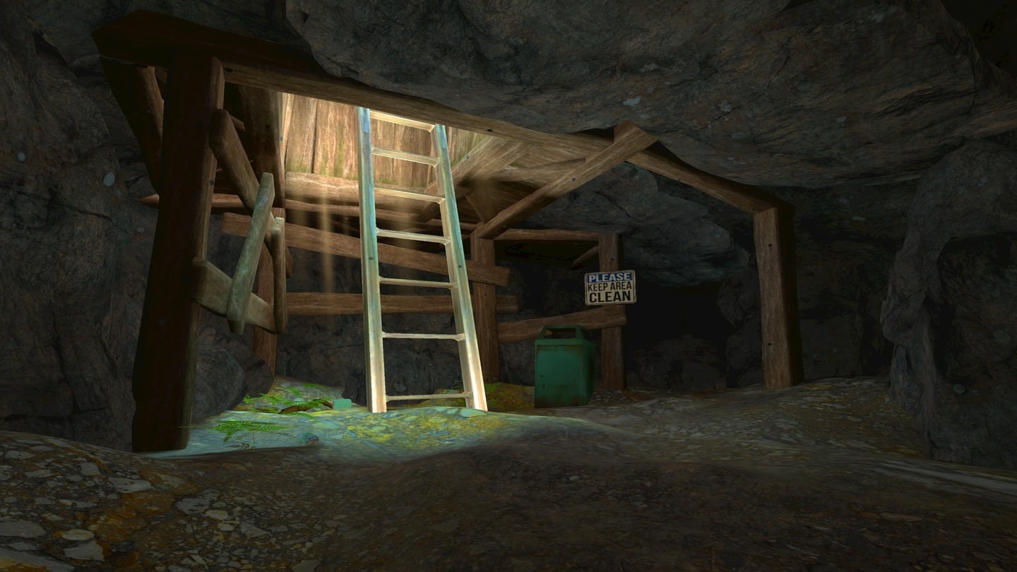
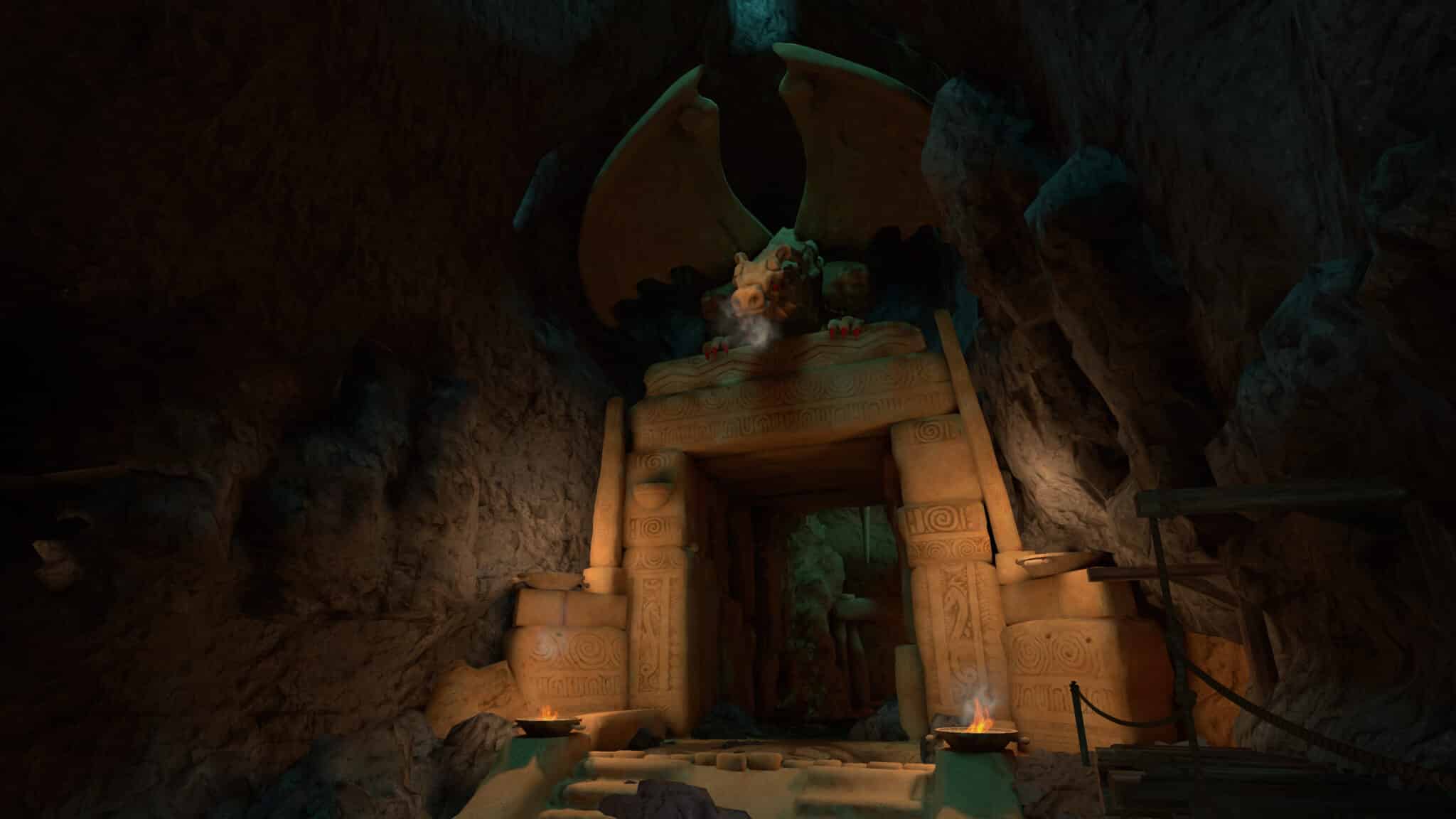
The recently released VR remake of Colossal Cave attempts to translate the original 1970s text adventure into a brand-new medium, while retaining the design of the original. Unfortunately, we can’t recommend the end result. Read on for our full Colossal Cave Quest 2 review.
The original Colossal Cave released in 1976 as one of the first all-text adventure games for computer systems. Almost 50 years later, adventure game legends Roberta and Ken Williams have brought the title to life on modern platforms. Reimagined in 3D for the first time, this new version of Colossal Cave is available on consoles, Quest 2 and Quest Pro, with a PSVR 2 release coming in March as well.
[vc_row][vc_column][vc_cta h2=””]Colossal Cave Review – The Facts
Platforms: Quest Pro, Quest 2 (Review conducted on Quest Pro)
Release Date: Out Now
Developer: Cygnus Entertainment
Price: $39.99
[/vc_cta][/vc_column][/vc_row][vc_row][vc_column][vc_column_text]
Ken and Roberta Williams have been very clear in communicating with the community that the new VR release of Colossal Cave has fundamentally not been changed in a design sense. This reimagining features the exact same puzzles, solutions, points system and content as the original. However, instead of interacting through text responses and imagining what’s being described to you over text, the game now features a whole 3D world to explore. In our hands-on preview last year, we said that experienced Colossal Cave players would probably feel like this new 3D version of the game is “a bit like watching a movie adaptation of a novel you’ve read to pieces.”
Control Conundrums

On a conceptual level, it’s remarkably cool to see such an iconic and landmark game be reimagined in 3D, both for flatscreen and VR platforms. The adaptation process would be tricky no matter what approach you take, and the effort to both preserve and update a piece of gaming history is commendable. The significance of such a release is certainly not lost.
However, Colossal Cave’s VR implementation completely misses the mark with several fundamental flaws that create an overwhelmingly tedious experience. Loading the game up for the first time, you’re presented with two movement options – ‘Comfort Locomotion’ and ‘Classic Locomotion’. Despite the names, neither of these options are industry-standard, comfortable nor intuitive to use.
Comfort Locomotion is the ‘preferred’ option that is ‘designed to reduce comfort sickness.’ With this option selected, you walk forward with the left Touch controller’s trigger and backwards with the grip button. You can change direction by physically moving the controller (like a rudder), or through thumbstick snap turning when stationary. It’s feels completely unintuitive to use.
Classic Locomotion is more akin to a traditional thumbstick-based movement system. You move forward and back with the left thumbstick, while snap turning is handled by the right thumbstick. In this mode, forward movement follows the direction of your head, but not continuously – it only moves forward in the direction your head was facing when you began pressing the thumbstick forward. Even if you look in a different direction while in motion, you’ll keep moving in the original direction. You can snap turn mid-movement or move diagonally with the thumbsticks, but the entire scheme ultimately still doesn’t feel quite right to use. It’s the closest option to what you’ll find elsewhere, but still different enough to be frustrating.
No matter which control scheme you go for, there’s no further options for vignetting, teleport movement or other comfort settings, besides an option to change movement speed. This means players who are susceptible to motion sickness and nausea will have to proceed with caution.
Let’s (Not) Get Physical

However, if you manage to get past the baffling movement options, the next misstep is the game’s interaction system. As you move through the depths of Colossal Cave, you’ll come across items and elements that you can interact with. However, instead of physically interacting with the world, Colossal Cave equips players with a raycasted cursor extending out from one controller.
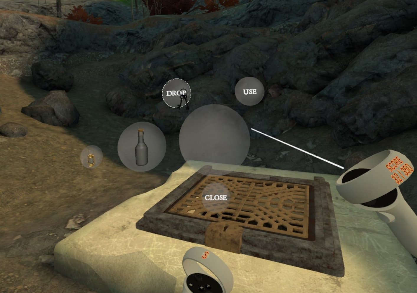
You aim this cursor around like a laser pointer, using it to examine items or touch/take them. The former ‘examine’ function is an inclusion that harks directly from the original game, but nonetheless feels odd when used in VR. You’ll find yourself listening to the narrator describe your environment or an item to you, as if you’re not already looking at it with your own two eyes. However, the real problem is that instead of picking up items within arm’s reach, you’ll use your controller-aimed cursor to point at items, select them and press floating buttons to perform actions like pick up or use. This means that when you’re in front of a closed door, for example, you click on the door with a cursor to open it, instead of pushing the door open with your virtual hands. Similarly, instead of picking up inventory items with your hands, you’ll use your cursor to select them and drag them into a floating ‘drop’ or ‘use’ button, pictured above.
It’s essentially similar to a point-and-click adventure game, except in VR. A recent post from Roberta and Ken Williams justified this decision as a way to ensure the game had a “cool retro feel” as opposed to something more modern. However, it severely impacts the game’s immersive potential – you may be walking through this new 3D world, but you’re also completely disconnected from it, interacting from a distance and without any feeling of physical participation.
Earlier this month, Roberta Williams told UploadVR that Meta originally opposed the point-and-click interaction system. “[Meta] wanted the real physicality. You’ve got your hands out there, you can grab and manipulate this stuff. I knew that that would be more difficult to pull off. I think they wanted the really physical stuff and it’s not a physical game.” While it’s true that the original Colossal Cave is not a physical game, taking those text-based actions – take, use, look – and giving players a way to perform them physically for the first time through VR is what would have made this release special. It’s the difference between just moving through an immersive environment and actually getting a feeling of true presence and participation, as if you’re really in the game world.
Using Touch controller cursors to click through menus and perform actions for you may be more true to the text inputs of the original game, but it feels completely out of place in a modern VR release. What’s worse is that the game also gives you the option to attempt an action that won’t do anything, only to inform you via the narrator. You’ll sometimes press ‘Use’ or attempt to grab an item with the cursor, only to hear the narrator proclaim “Nothing happens” or “You can’t do that.” It’s another hangover from the original text release – essential in that version, but unnecessary and immediately tedious in VR.
Going beyond those core problems, there are other minor issues that make the game feel unpolished and rough around the edges as well. I frequently got stuck on geometry when moving, hit frustrating invisible walls in the environment or found myself repositioned around the wrong way when entering a new area.
The user interface is visually uninteresting and some elements, such as the score display on the Touch controller rings, look half-hearted, verging on amateurish. It doesn’t help that Colossal Cave opts to use the default white Touch controller skins. A little effort to create personlized or themed controller skins for the game – as you see in most other VR releases – would have gone a long way for polish and cohesiveness.
Colossal Cave Review – Final Verdict

Between all of the game’s fundamental and minor issues, it was hard to play – let alone enjoy – the actual core Colossal Cave experience that this release has reimagined. I soon gave up trying, and opened up the original text-based version instead.
Aiming for a “cool retro feel” with Colossal Cave’s reimagining is a sweet sentiment that honors the original game’s place in history. However, the result also makes some poor assumptions about what VR affords the player. It takes a game from an age in which it was tedious to play games – the rewards of trial and error spread across hours – and carries it over, with few changes, to a medium where tedium is poison.
The audience that will find something valuable with this VR reimagining is incredibly small, mostly split between players with experience of the original or those curious about video game history. Even for them, the VR design choices will be jarring and hamper the core Colossal Cave experience, rather than enabling it. That audience, however, does not include those looking for a satisfying adventure in VR and that’s why you should probably steer clear of Colossal Cave until further notice… At least in VR, anyway.

UploadVR focuses on a label system for reviews, rather than a numeric score. Our reviews fall into one of four categories: Essential, Recommended, Avoid and reviews that we leave unlabeled. You can read more about our review guidelines here.


