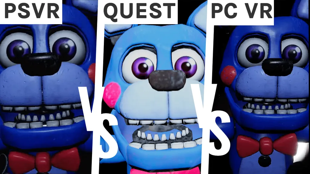
We’re back with a graphics comparison for Five Nights At Freddy’s VR now that its highly anticipated (and largely excellent) Quest port has arrived!
Check out our video below, where we’ll be going through each of the game modes, starting with the main campaign. The main themes that you’ll pick up on in any comparison is that PC VR predictably gives the crispest and clearest overall look, while PSVR typically has softer edges and Quest shows complete lighting changes to get it running on the headset. And Five Nights At Freddy’s Help Wanted is a great showcase of how these differences don’t have to impact gameplay; really we think it looks great on any headset. While PC VR and PSVR seem pretty much on par, you can notice subtle differences such as the static on the screen and the harsher contrast between light and dark on the Quest edition.
Initial impressions in the Dark Rooms levels are that Quest is definitely overall lighter, which is something we also saw with Layers Of Fear where some lights were permanently left on. Particularly in these levels, you can see the lack of detail in the flashlight and overexposed lighting, especially in the, uh, close-up moments. The Quest also lacks small details such as the flecks of dust in the air, some of the furniture looks a little flat, and textures are often blurred. Again, the static is different when you’re caught by the animatronics.
And finally, we have Plushtrap, which is easily the simplest game mode. As we only have a couple things to concentrate on – mainly the rabbit animatronic – PC VR hails absolute king with eery details coming through even at this distance, with PSVR close behind, and Quest clearly lacking in comparison, being the least clear and also giving the rabbit a slightly weird cheese single shade of yellow.
What do you think of the game’s visuals? Let us know in the comments below!

