Swipe, swipe, swipe …. swipe, swipe, swipe…. swipeswipeswipeswipe. That used to be what finding an app in your GearVR library was like, a tedious chore with far too many swipes. It was inefficient, it was clumsy, and it was far from elegant… and now its gone. Today, Samsung and Oculus pushed a new update for the GearVR that brings with it a number of changes to the UI.

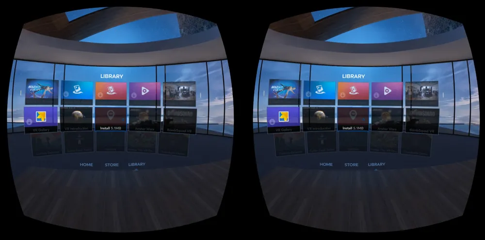
First and foremost, the library is now easily browsable. Gone is the long line of apps that you had to swipe through á la iTune’s cover flow, in its stead is a new grid based view. Apps are shown on a five by two grid, and as you swipe up or down to scroll through the library a third row rolls up or down and fades in. This simple change makes the device much easier to use, especially in demoing situations; which is important because as John Carmack said at GDC, “every GearVR has been on at least ten people’s heads.” Gone will be the days of – ‘hold on, let me find that app for you.’

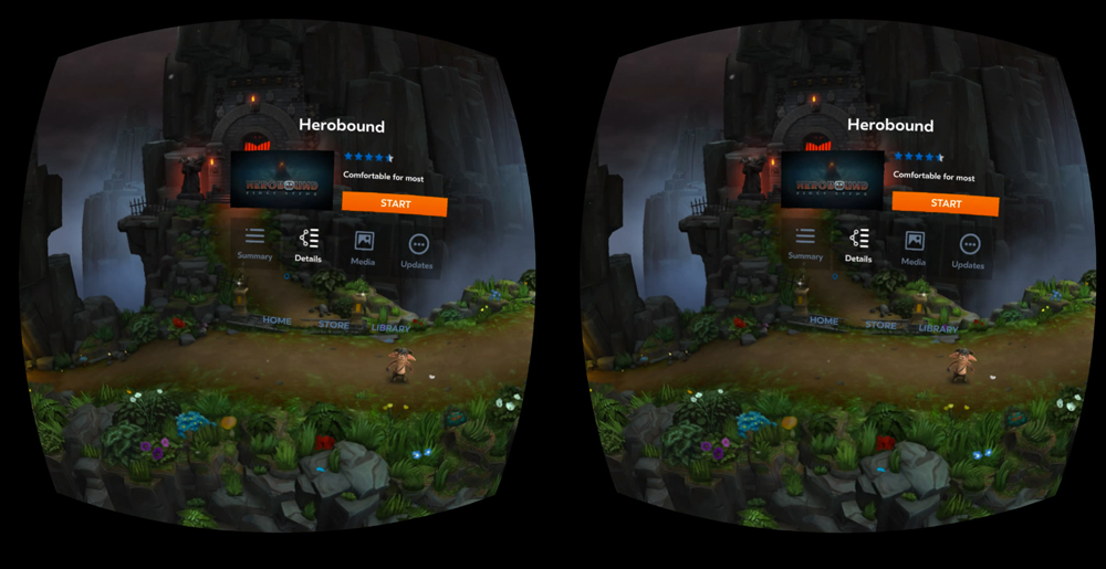
Additionally, it looks like 360 degree screenshots are finally going to become a thing. For some games, the new UI has a 360 screenshot that loads when you select ‘more info’ on any of the games. This is a really great way to get a quick preview of the game, and get a sense for the environment. It was a simple tweak but one that was needed.

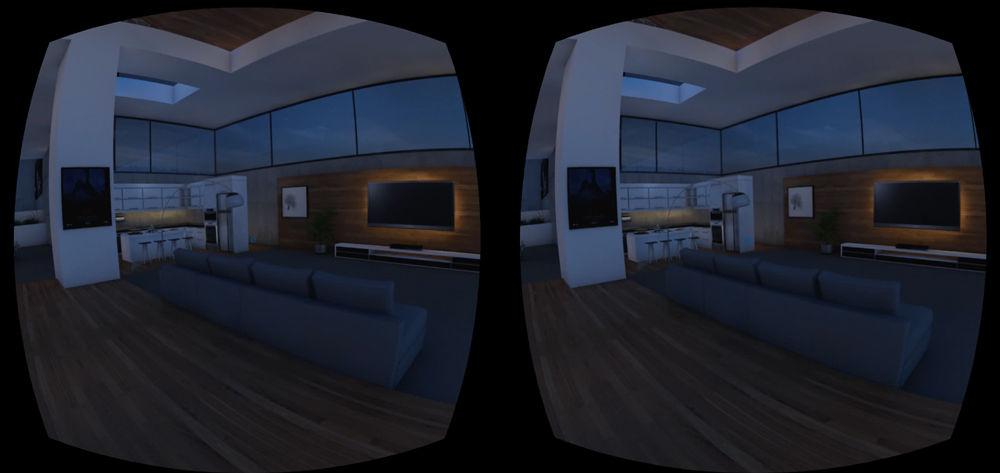
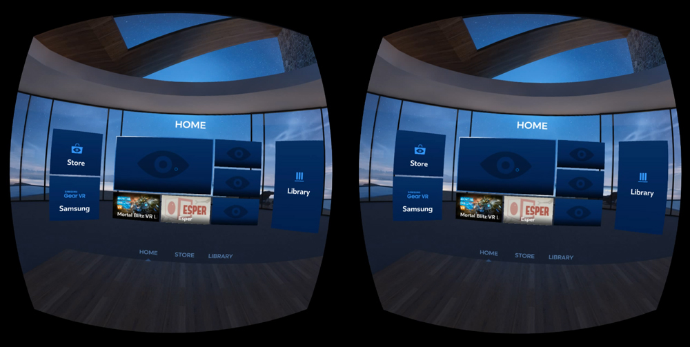
The new gridded library and 360 screenshots aren’t the only changes. As soon as you turn on your GearVR you will notice that things feel a whole lot more homy. Oculus has replaced the blue background of the home screen UI with a modern looking home interior, which is also a very welcomed change. The scene they choose looks like something out of a modern design catalogue: sleek, sexy and classy. A big glass window sits behind the home page UI with a view behind it. The home page UI is also slightly different, it looks like it was pushed back slightly with the side flaps spread out a bit further and curved towards the user. Additionally the center crosshair has changed from a filled in circle to an outline of one. The view was my only real gripe with the new UI as it seemed a little flat to me, it simply didn’t have the depth of the rest of the home, which made it stand out in a not so great way.
Many of these changes may be purely aesthetic, but they make a difference. Creating a more home-like feel to the initial launch page give people a much more welcoming entry into the GearVR, something that will be important as more and more people experience the device for the first time. Additionally, the tweaks to the UI go a long towards making the device much more user friendly. The new update overall feels like a nice improvement over what we had before.
UPDATE: For those not seeing the new updated Home. You can force it by going to your phone’s storage and uninstalled Oculus Home. Then insert your phone in Gearvr. It will tell you to remove the headset and finish the install. It will download the newest Oculus Home and install it. (Thanks to reddit user Mallmagician for providing the workaround)


