Tilt Brush is positioned as a key application in the virtual reality ecosystem. Not just by the virtue of its early timing, Tilt Brush remains a high quality and ever evolving tool for those wishing to create in virtual spaces. With such a status, it makes sense that any new program even slightly resembling it sparks comparison in a discussion. Gravity Sketch is the latest to fall under the microscope within the 3D design arena. It’s is a creation tool that simplifies 3D design for objects, scenes, and more and Oluwaseyi Sosanya, the co-founder of Gravity Sketch, spoke with us in-depth about the tool and the development team’s goals for it.
Illustrator vs. Photoshop
Immediately Sosanya broke down the easy comparison to Tilt Brush, using popular Adobe software as an analogy. “If we’re looking at it for face value today you can kind of look at Tilt Brush as Photoshop and we’re Adobe Illustrator,” he says. “We were not trying to create these majestic scenes in VR. We’re actually trying to fit in with existing workflows for designers, architects, and concept artists.”
Essentially, while Photoshop is great at creating photo-realistic images, Illustrator lays the foundation for different interfaces. With this same idea, the Gravity Sketch developers believe this new experience aligns with Tilt Brush as a companion rather than competing against it. Sosanya says he’s even witnessed instances where objects were designed in Gravity Sketch and then exported to Tilt Brush to dress them up.
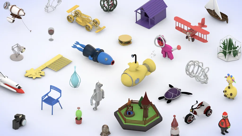
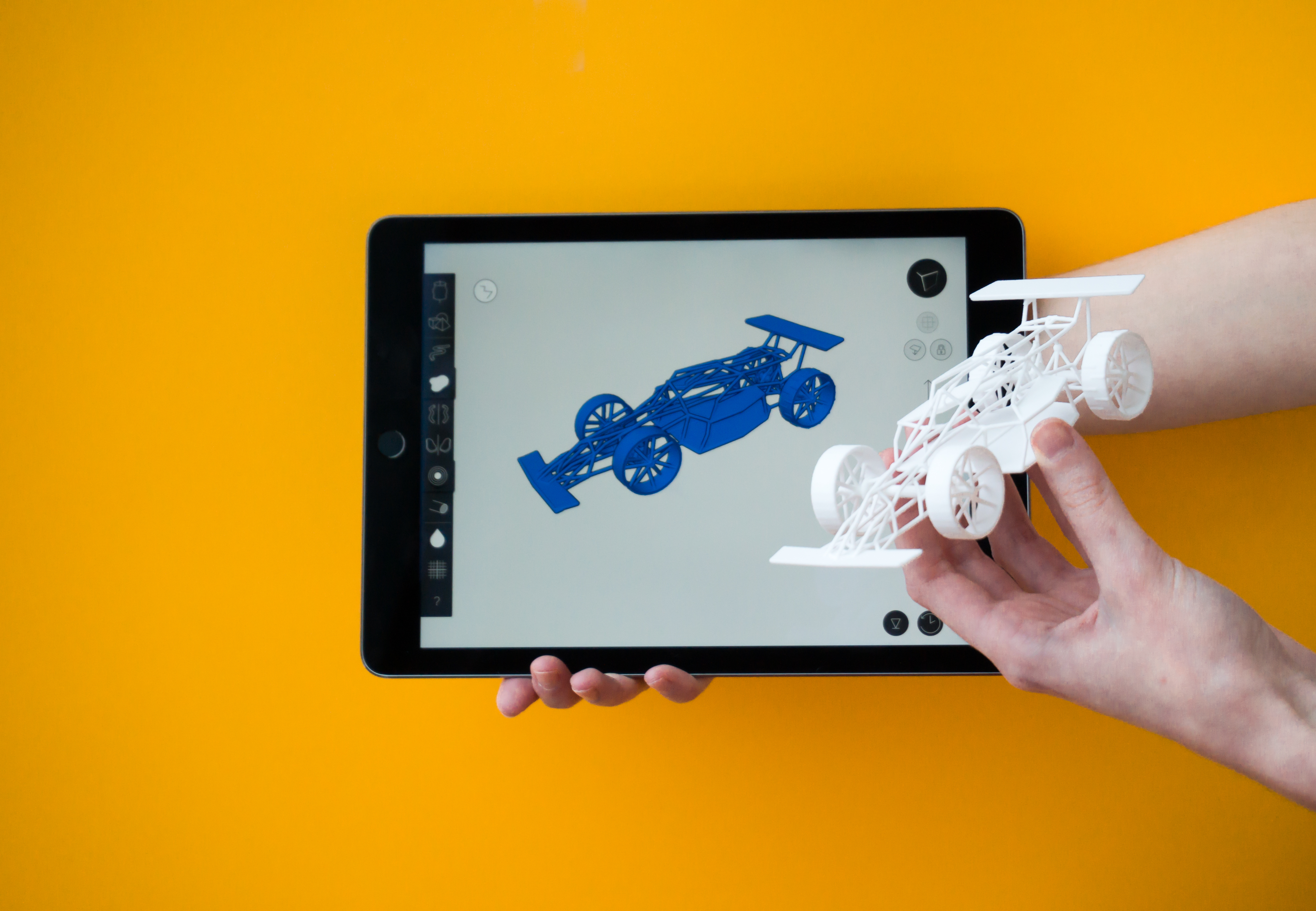
What makes Gravity Sketch an efficient 3D design tool comes down to its ease-of-use. You draw as easily as sketching on a piece of paper and it produces 3D models with thickness and volume that you can scale and modify freely in a virtual space. These models can then be introduced seamlessly to a CAD platform for more in-depth design and drafting, or even used for 3D printing.
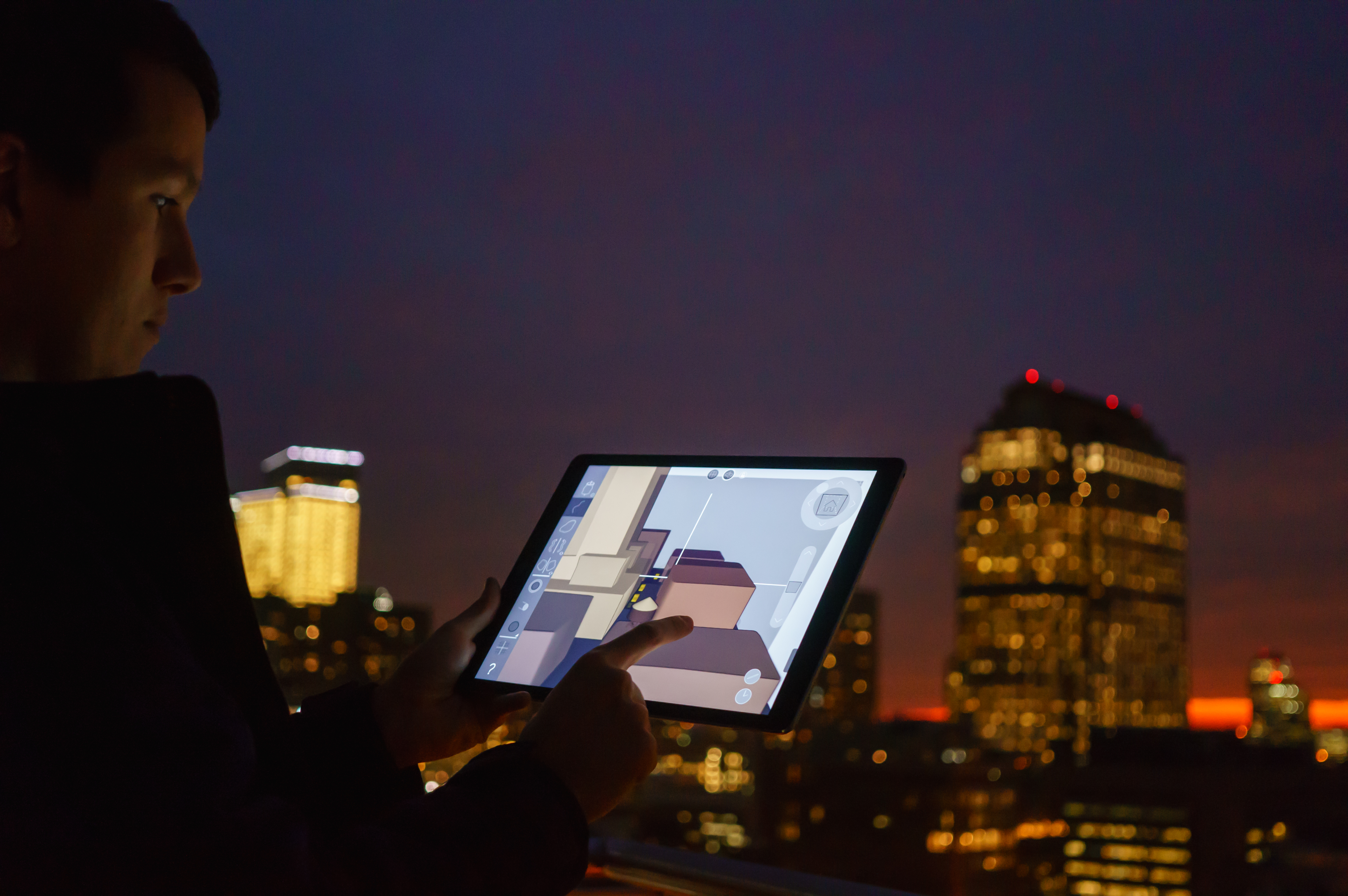
“There are some great tools out there like SketchUp and Blender which are kind of making it really easy and natural for people to kind of get in,” Sosanya explains. “But the vocabulary requirements and the kind of mathematics behind operating within the software is really challenging especially for kind of non-literary thinkers.” Gravity Sketch is a tool for creators that think spatially, so the app removes a lot of the text and numbers from the interface, approaching with a “show” over “tell” design. For example, the program’s 3D interface does a good job of showing exactly what a tool will do when selected as opposed to drop-downs of text explaining them. It’s a stripped-down and clean UI that is even available in the iPad version of the application.
“Part of our mission is not just about creating an awesome tool but it’s also starting to be one of the early people that lay the foundation for how interaction should happen in 3D,” Sosanya proclaims. “Even from our interface we want to make a statement. We want to actually start to pave way for the future and we do hope that people take inspiration from us.”
In March of this year, the 4-person team released a limited Beta for iPad and have been making adjustments with user feedback in anticipation of the VR release. They’ve got a few people involved in the VR early access version as well. They’re targeting January for launch. It will be coming to the HTC Vive first with Oculus Rift and Touch implementation soon after, so it won’t be long before we see if the developers’ mission comes to life.


