So I finally got to “Step into the Rift,” and in a word – it was awesome.
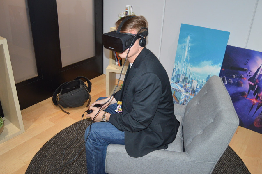
As I entered the room the first thing that was immediately apparent was Oculus was returning to its seated expierence roots. The room itself was set up like a mock living room. There was a chair in the middle of the room, something I haven’t seen from Oculus since they began demoing the Crescent Bay.
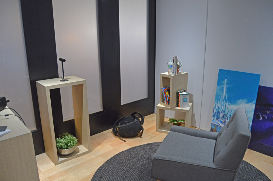
I sat down and got comfortable – looking at the positional camera in front of me it appeared to be about four to five feet from the chair I was sitting in – to give you some sense of dimensionality – which is important given we will be discussing some of the tested tracking limits with one positional camera. (We have learned that you can combine tracking cameras to expand this range)
Once I was comfortable, the attendant handed me the Rift. It felt extremely light in the hands – definitely lighter than any of the previous headsets, significantly so over the DK2 and a more moderate improvement over the Crescent Bay. The fabric on the outside was extremely nice, it gave the Rift a very polished feel – something that consumers will likely really enjoy.
Knowing that the Oculus had been designed to allow people to wear their glasses within the headset – I decided to test that, putting on an HMD wearing my large framed glasses for the first time ever. It felt comfortable on the face, I didn’t sense that my lenses were scratching against the lenses of the headset at all – an important factor for sure.
I adjusted the headset on my face and got comfortable in the chair – a place I wouldn’t stay for long because ain’t nobody going to put baby in a seated corner.
Oculus Home
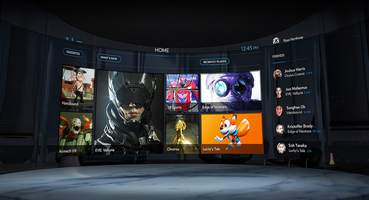
The first thing I saw when I put on the headset was the new white Oculus logo with a transparent black layer covering the scene. The attendant pressed the space bar on the Rig and started the experience. The logo disappeared and suddenly I was in a gorgeous modern room – I spent a second looking around before the menu popped up in front of me. This was the new Oculus Home.
Those who have tried the new Gear VR UI probably can get a decent sense of what I was looking at – it was a similarly designed room – and the options floated in front of me. I was able to use my gaze and the Xbox controller in my hands to select the demo I wanted to do – I of course sat there and tried almost all before I was finally ushered out the door. We will get to the experiences themselves in some articles to follow but safe to say they were pretty great.
Positional Tracking
The one thing that I was most eager to test was the tracking volume of the headset. I stood up from the chair and walked to the edges of the tracking volume – having the attendant take photos of me as I did. The demo I tried this in was Insomniac’s Edge of Nowhere an Artic third person adventure game. As I made my way to the edges of the tracking volume a handy ‘you are at the edge of the tracking zone’ warning flashed on the screen.
One thing in particular before getting to the approximate size was that I noticed that when the positional tracking “broke” it didn’t do the nauseating skip that I have noticed on previous headsets where the camera suddenly snaps as the camera struggles to find the headset. This was definitely a very welcome improvement.
Some more notes before we continue – the approximate size of the space in total was about 10×10 ft. The camera was placed at about eye level from a seated position so about three and a half feet high. I am personally about 6’1” tall so when I stood up I was able to test the vertical limits of the headset.
Here are the photos from that test:
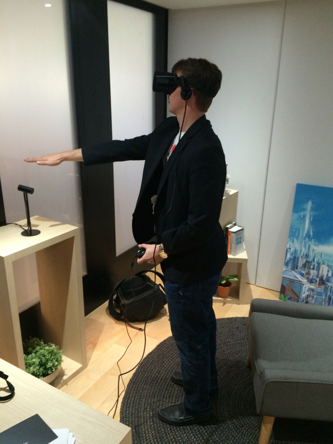
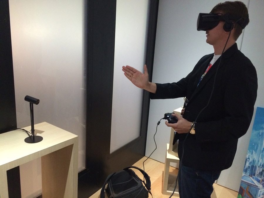
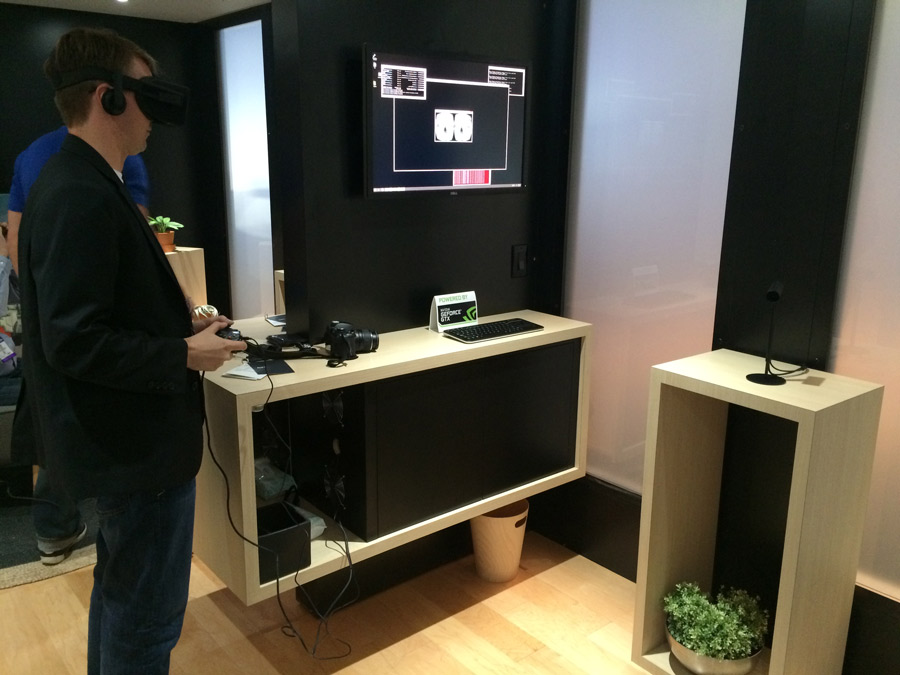
It would seem that the volume was about four or five short steps to either side from the center, from about three feet back. Which definitely felt wider than the DK2 but it was hard to tell just how much better it was than the Crescent Bay. One thing for sure though was it was far smoother on the edges of the tracking zone than it has been in the past.
Ergonomics and Display
In terms of how the Rift looked and felt – it was definitely more comfortable than previous iterations. Palmer gushed before about how much effort the team had put into the ergonomics of the device and it was apparent from the get-go. After about two minutes it felt like the headset disappeared on my face – just as a good lightweight pair of ski goggles might. I felt like I could have worn it for hours – which I almost did, I was in the Rift for about 45 minutes straight. (And afterwards walked away with no ‘Rift Face’).
In terms of display – it is hard to say it was improved drastically over the Crescent Bay but it definitely felt a notch clearer. One of the things I did notice however was how much deeper the blacks felt, something that I think was absolutely crucial to the immersiveness factor. A number of the demos I tried had very dark scenes and they all looked great on the Rift. Additionally, the colors felt brighter and more vibrant. The resolution may or may not be better but the screen itself definitely felt different and improved. Oh – and there was absolutely no screen door that I could see. I really tried to focus on individual pixels and found it to be quite difficult.
Also – text legibility was vastly improved. UI elements in games were far more clear. Those worried about being able to have crisp displays with legible text need not worry any longer.
Overall
Overall the Oculus Rift consumer version feels like a decided improvement. We didn’t get a chance to go hands on yet with the new Halfmoon/Touch input controllers but will be later this afternoon, so stay tuned for that. I am still having difficulty getting over how darn comfortable the headset is. For me, this may be the single biggest and most important factor – as I would get exhausted wearing the DK2 for more than 30 minutes at a time. Oculus has created a virtual reality headset that transports you to amazing new worlds with incredible clarity – all the while remaining comfortable enough for you to want to remain there.
Comparing the headset with the Morpheus and the Vive – it definitely felt like it had an improved display over those – if not with resolution with picture quality. The tracking is better than that on the Morpheus by a margin, while still not matching that of the HTC Vive – although it remains to be seen how that changes with two positional cameras. The refresh rate was nice – but was still less than the Morpheus’ top end – but it wasn’t something that I felt I noticed significantly. All in all for me, and based on the editions of the headsets I have tried I think that consumers will face a difficult choice between the Vive and the Oculus for top end experiences. For those who play seated games exclusively, however, the Oculus definitely seems to be the choice of the three – at least until we see the consumer edition of the Vive – which promises to be improved over the dev kits.
We will be reporting back with a lot more news in the coming days so be sure to stay tuned for more.


