Oculus Touch’s new revision is born more out of necessity than opportunity. 2019 sees Facebook’s VR hardware make the jump from outside-in positional tracking, which uses external sensors, to an inside-out system that instead has sensors mounted on the device. You can see the tech employed in the new Oculus Rift S and Oculus Quest headsets.
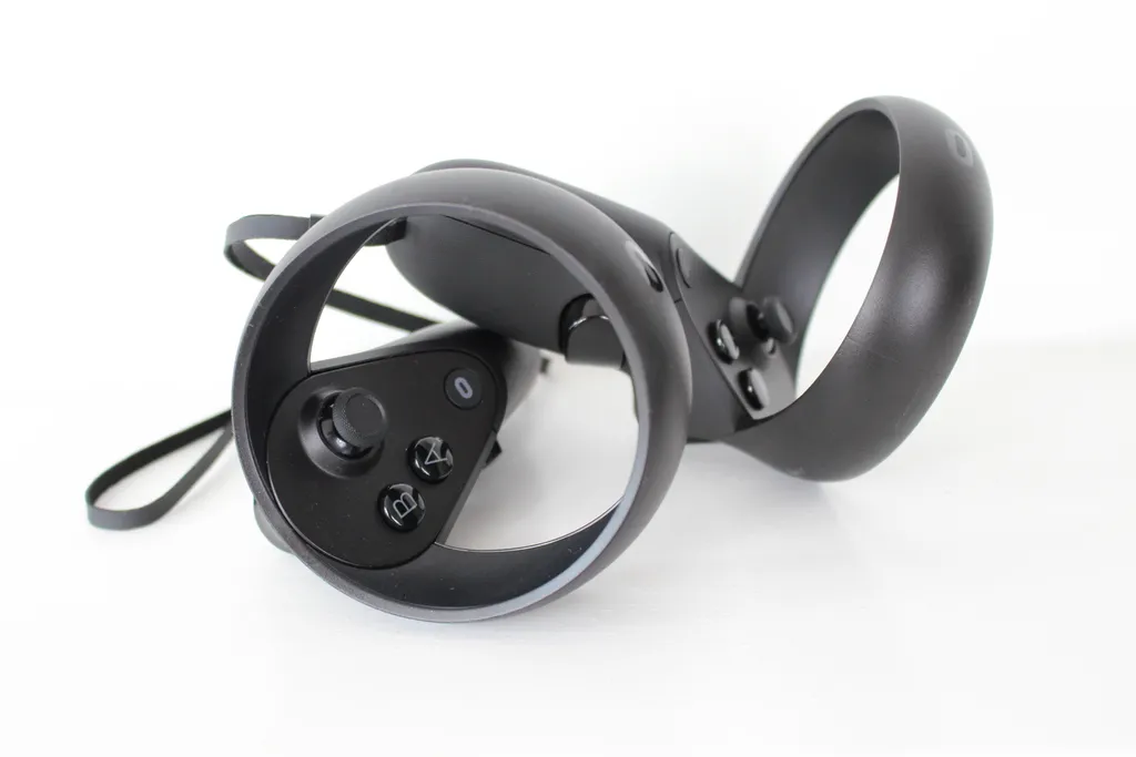
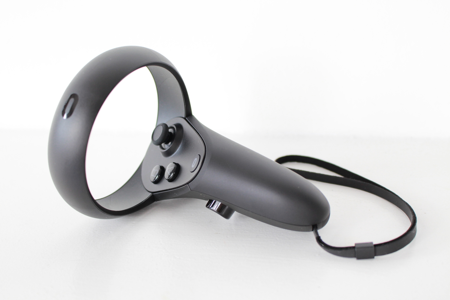
As such, Oculus Touch is in need of a bit of a refresh. The original Touch had a tracking ring that looped under your hand, but Rift S and Quest’s sensors wouldn’t be able to spot that. Instead, the loop now runs over the top of the controller. You might think it’s a minor change, but it does impact the overall ergonomics of the controller, and not necessarily for the better.
Some Things Never Change
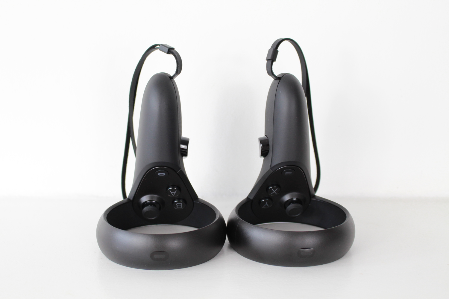
To be clear, this new Touch is still an amazing piece of technology. It offers all the same buttons and features as the original version. Each has two face buttons, a clickable analog stick and grip and trigger buttons. The right controller also sports an Oculus button whereas the left swaps it with a menu button. Finally, the same basic ‘finger tracking’ function, which detects which buttons you’re touching (if any), is still present. These features have helped make Touch the best VR controller since its launch in 2016, and they remain just as compelling here.
That is with exception of the Oculus button, which is now located closer to the face buttons. On the original, it would happily sit to the right side of your thumb when you pressed ‘A’ and ‘B’, but now it’s easier to accidentally press it with the base of your thumb. It won’t happen often but you will find yourself more aware of it which, in turn, occasionally distracts you from the virtual task at hand.
Tracking
You can read our separate impressions on tracking the Touch controllers with either Rift S or Quest in their respective reviews. Broadly speaking, though Touch offers solid, precise VR tracking on both platforms, with the limitations of inside-out tracking holding it back in certain scenarios. It’s not a good idea to bring the controllers up close to the headset, for example, and you can easily occlude one tracking ring by holding the other over the top of it.
Half A Step Forward
The build quality of the new Touch is largely as good as the old, except for a few things. The back of the controller now has a more textured grip. In fact, the entire device feels like it has just a touch more friction to it, which will hopefully save us all some smashed lights and TV screens in the years to come.
Half A Step Back
For the most part, the tracking ring is kept out of the way, but not entirely. If you do a thumbs up gesture (which many apps will simulate), you might find your thumb knocking against the top of the ring. In fact, you can reach any part of the ring with your thumb very easily. If, like me, you’re a bit of a fidget, you’ll miss the freedom the original’s bottom ring afforded you. The original Touch also had enough space to rest your thumb on the side when you weren’t pressing buttons, allowing for a more natural grasp. These new devices don’t enjoy that luxury.
It also makes the controllers feel ever so slightly off balance. They’re now just a touch top heavy, which will only be noticeable to those that spent extensive time with the original Touch. It’s not that it’s a problem so much as it was just a bit better the first time around.
Battery
I can’t speak to exactly how long the battery life lasts in the new Touch because, well, they haven’t run out yet. In fact, After around ten or so hours inside Quest, the Oculus Home screen still tells me there’s 90% battery life left in each. It is a shame, though, that Oculus decided to continue on with external AA batteries in this revision rather than adding a rechargeable solution. It undoubtedly helps keep cost down for Oculus but, in the long-term, stacks up the price for its customers. I’d have happily traded some of the controller’s lengthy battery life for such a solution.
Conclusion
Your impressions of the new Oculus Touch controllers will ultimately depend on how much time you spent with the originals. These are amazing controllers, capable of tracking your hands in VR to an incredibly precise degree. But, if it came down to preferences, we’d definitely favor the original model. The overall design is slightly less intuitive, with redistributed weight and a tracking ring that every so slightly restricts your freedom. The changes aren’t anywhere near damaging enough to deter from adopting either of Facebook’s new headsets, but we’ll certainly miss the days of the original Touch.


