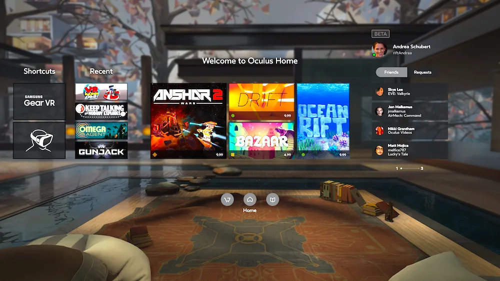
Both Oculus Rift and Gear VR run on the Oculus Home ecosystem, but offered different interfaces in the past. As previously promised, that’s changed this week.
Multiple Gear VR users are reporting that an update to the Oculus Home app is bringing it in line with the version currently seen on the Oculus Rift. You can see the change in a video below from Gear VR user Pablo Flores, and other users on Twitter seem to have confirmed the switch. Previously, the Gear version of the app was set inside a stylish apartment overlooking a beautiful blue sky. It appears users have now packed up their things and moved downstairs to join the Rift’s cosier, quieter quarters.
With that change comes another for the Gear VR’s user-interface. As Flores’ video confirms, it too is now mostly identical to what’s available in the Rift version of the app. Granted the two weren’t hugely different to begin with, and the Gear VR version is still missing a friends section.
It does finally allow you to refine your search for content on the mobile headset, though, which previously had you just sifting through pages and pages of games before you found the game or experience you were looking for. Now you can order content by category and in alphabetical order.
It’s an interesting time for Gear VR, which enjoyed around a six month period of being the only major consumer VR headset available before both the Oculus Rift and HTC Vive arrived earlier this year. Not only that, but it’s soon to face stiff competition from Google’s Daydream platform for mobile VR. Perhaps the move to bring the mobile version of Oculus Home more in line with the PC edition will help to unify the Rift and Gear even more and combat the challenges ahead.
If this means we see new features like cross-buy support between the two then we’re all for it, though Oculus has said that this is entirely up to developers in the past. Either way, it’s good to see a little more unity across the two devices going forward.


