Before we get started, let me make something perfectly clear: what is about to follow is an opinion I have formed after spending considerable time with both the HTC Vive and Oculus Rift’s hand tracking solutions for virtual reality.
Many people have had the chance to try the Vive controllers now that that product is out in the wild. However, its chief competitor – Oculus Touch – has yet to be released and, as a result, I am one of the lucky few able to say they’ve tried this hardware extensively. Because of this unique position, I wanted to chime in with my two cents on which of these systems is the better piece of tech.
I’ve broken my rubric down into categories and – because we still don’t know what Touch will cost – economics will not be one of them. This is not about which system you should buy, just which device I think is most impressive.
Okay, let’s get started.
Tracking – Winner: Vive
An area of obvious importance for a hand tracked controller is, well, tracking. If the controllers are too easily occluded or collisions cannot be detected precisely, then there is very little point in having a hand controller at all.
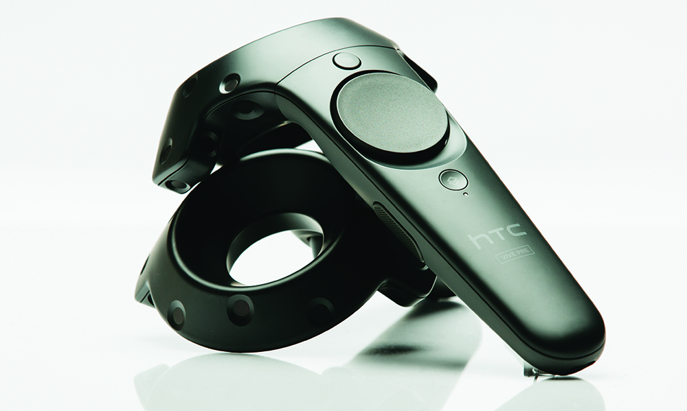
In this first category the HTC Vive controllers (which I’ll refer to from here on out as “Wands”) have the edge. The Vive’s lighthouse tracking system allows for sub-millimeter object detections. I do not know Oculus Touch’s official specs in this regard (and probably won’t until it is more widly distributed) but I have noticed a slight advantage for the Vive in terms of hand tracking precision.
However, just because the Vive Wands have the edge here does not mean that Touch is severely lacking in this respect. I have yet to experience any occlusion, poor collision detection, or significant jutter while using either controller.
Ergonomics – Winner: Touch
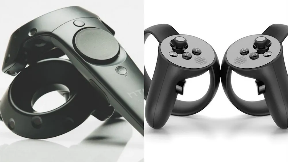
When it comes to ergonomics there is simply no contest between Touch and the Vive. Touch takes this category by a landslide. The Wands never feel uncomfortable in your hands, but they also don’t do much in the way of creatively navigating your body’s natural movements.
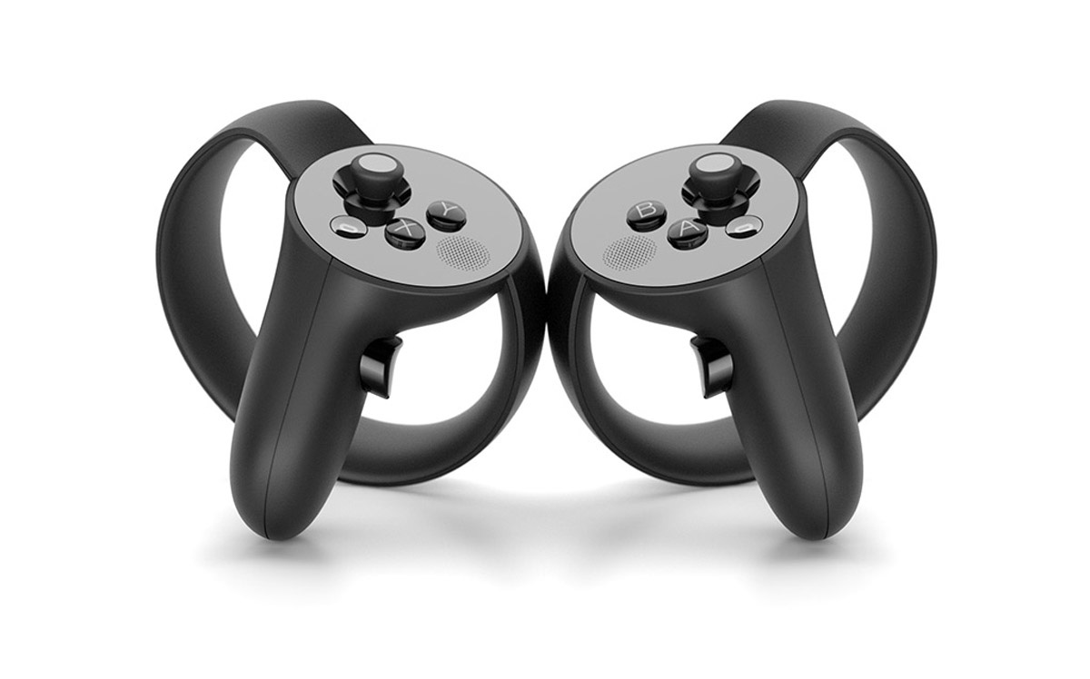
Touch, on the other hand, was so clearly designed with the human hand in mind that it makes simply holding them a deeply satisfying experience. Your fingers naturally fall into place over the buttons and joysticks that they correspond to, which makes understanding how to use the device incredibly intuitive, even for first-time users.
The only caveat to this is that users with particularly large hands may have trouble finding the same sweet spots but this is only truly applicable in very extreme cases. All in all, Touch is one of the most delightfully designed devices I’ve ever had the opportunity to experience.
Buttons – Winner: Touch
Touch and the Vive Wands both have trigger, grip and menu buttons but that is where there similarities begin to end. The Wands employ a trackpad style click wheel for many in-game interfaces while Touch opts for joysticks and motion tracking gesture sensors instead.
This is by far one of the more subjective decisions in this review but, for me, I have to give the nod to Touch once again for its layout. Nintendo created the Rosetta Stone of modern controller design in 1983 for the NES and, as a gamer, I’ve therefore been trained for years to use an “A/B button” style contraption. I also think that its addition of analog sticks adds in a greater potential for creative movement options for a variety of VR experiences.
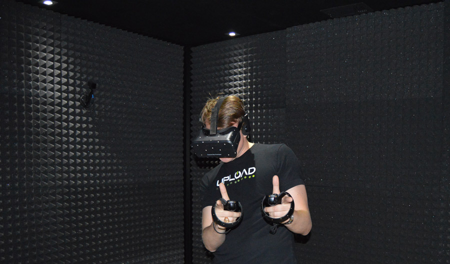
Touch’s gesture controls put them over the top in terms of interface as well. It is enjoyable to press a button with an outstretched index finger, or shoot a friend the occasional thumbs up, rather than only being able to enjoy open/closed fist options for interaction.
Materials – Winner: Vive
When it comes to the overall construction of these controllers I was tempted to cop out a bit and simply declare it a tie. I didn’t think it would be right for me to imply that either of these handsets are built with anything other than the utmost care and using top quality components.
However, I am giving this category to the Vive Wands on the basis that the Touch’s grip and trigger buttons are somewhat inferior to its competitor’s. These buttons can be a bit too easily depressed and hopefully the final version of Touch will increase their action for a more responsive experience.
Hand Presence – Winner: Touch
“Hand presence” is the term used for the moment in a game when you begin to believe that the floating digital hands in front of you are actually your own. Achieving this requires a finely tuned marriage between hardware, software, and game design but, when it works, it is simply fantastic.
The controller that most often provides me with this sensation is Oculus Touch. Because of the brilliant ergonomics of the device my hands are able to move as they naturally would as I interact interacting with the VR assets around me.
Picking up an object, for example, employs all of the same hand muscles with Touch as it would in a real life situation. Gesture controls are again key here as they help remove any cognitive dissonance between your brain and that virtual phone you’re dialing.
This was a tough call, but in the end I feel that the Vive wands are always providing you with a slight reminder that you are already holding something real in your hands, while Oculus Touch is much more successful in melting away as you engage with a given VR experience.
Side Note: The “Room Scale” Dilemma
Many people tie the existence of hand-controllers into what’s known as “room scale” VR. These are VR experiences designed with a large, roamable play space in mind. Room scale games allow you to turn around and encourage you to crouch, walk, and otherwise physically explore the space of the game world you are in.
It is true that most Oculus Touch games would not be considered room scale and instead focus more on 180 degree experiences in which the action is happening mainly in front of you and you have no real reason to move your feet. However, I have also played touch games in which I am ducking, strafing, turning around, or otherwise physically engaging my digital surroundings.
I consider room-scale to be one of the many features accessible in a VR develope’s tool chest for both Touch and Vive. If a studio wanted to make a room-scale Touch title then, from what I have seen, they could. But, like all features, room scale is sometimes employed brilliantly and sometimes misrepresented horribly. For me, playing a fun game is more important than playing a game with a shoehorned element. As a result I didn’t decide that Touch was inferior to the Vive Wands simply because its experience required me to pick up my feet less often.
–
Overall Winner: Oculus Touch
Oculus Touch is a marvel of engineering that has the potential to infuse VR hand interaction with an entirely new level of immersion. The device is artfully designed, a joy to use, and incredibly intuitive to pick up and start playing. The importance of Touch’s ergonomics and gesture controls in establishing hand presence is ultimately what makes the controllers the most appealing.
Valve and HTC deserve a ton of credit for pioneering VR hand tracking and building the system that convinced the world hand controls would be essential to the industry’s future. Touch may be a successor to this groundbreaking innovation, but in this case the student has definitely surpassed the master.
The next evolution of VR is on its way everyone, and now we just need to figure out when.

