The moment a lot of you have been waiting for is finally here; Onward is now available on Oculus Quest. But how does it stack up next to the PC VR original. Find out in our Onward graphics comparison.
NOTE: This is a comparison of the PC VR version before this week’s update that enables cross-play with the Quest version. If you’re looking for our comparison of the PC VR 1.7 and 1.8 versions, you can find that here.
Best strap yourself in for this one.
Onward Graphics Comparison
For starters, let’s point out that getting Onward to run on Quest at all is a huge achievement, especially with a solid framerate. That alone, paired with the wireless freedom of the headset, will give lots of people lots of reasons to love this port. But there’s no escaping the heavy sacrifices made to get it here.
Functionally, all of Onward is here. Well, most of it is – certain maps have been tweaked from the PC VR versions to fit them onto Quest, but the original editions are also being edited to enable cross-play from PC to Quest, too. You can see just a few of those differences in this article, but we’re here specifically to talk about graphics and, truthfully, this is one of the rougher Quest ports out there.
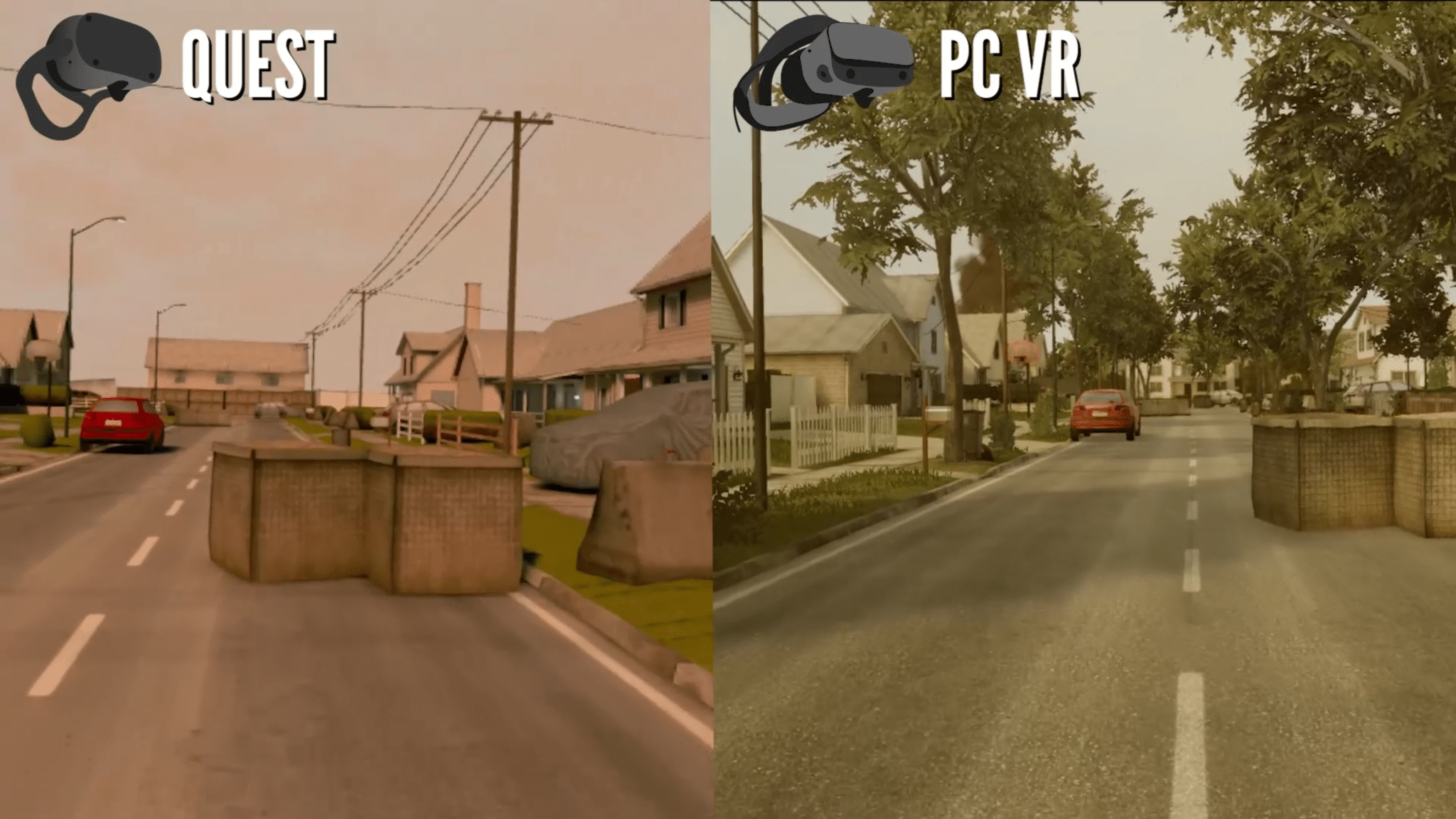
In the video above we walk through three of the online shooter’s levels (take note, this is the pre-patch version on PC). They range in differences but we’ll start out with Suburbia, which is essentially Onward’s answer to Call of Duty’s Nuketown map. The conversion is perhaps the most striking in the entire port.
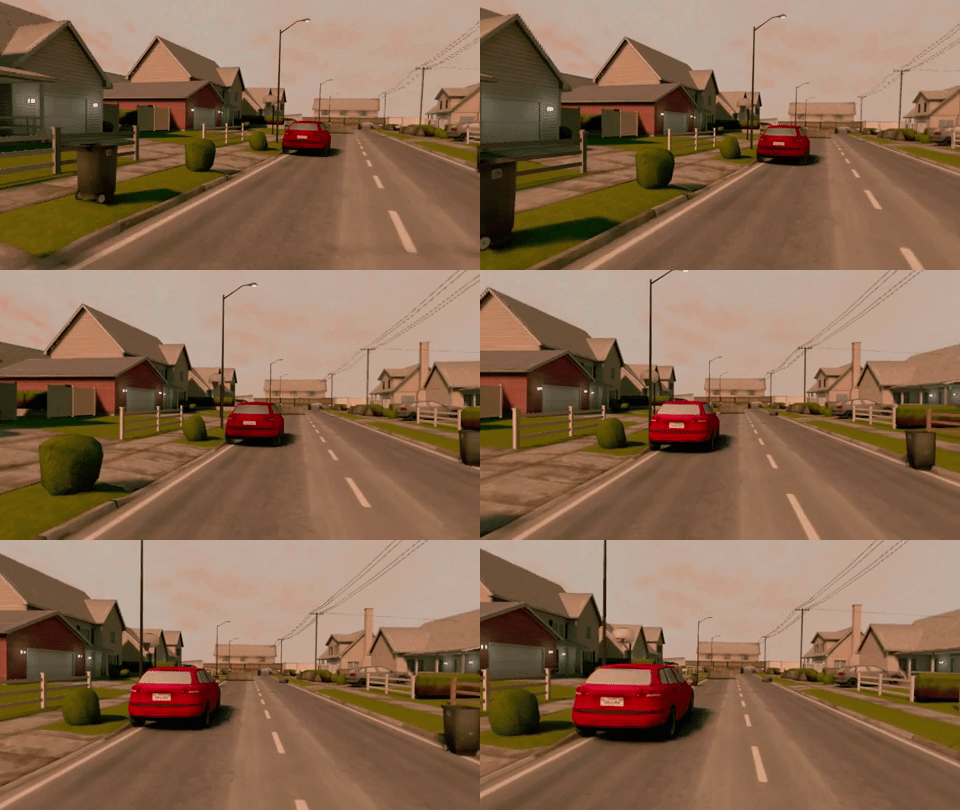
There’s a lot to go over here, and it’s best left to the video above. But even at a glance, the differences are night and day. Suburbia suffers from dramatically scaled-down foliage; there are no trees to speak of and the once colorful plants lining houses have been reduced to tiny green blobs. The surrounding border has been drawn right in, making the map resemble more of a laser tag course than a real-world location. In motion, you’ll notice some hefty texture pop-in, too, particularly as you approach the red car there.
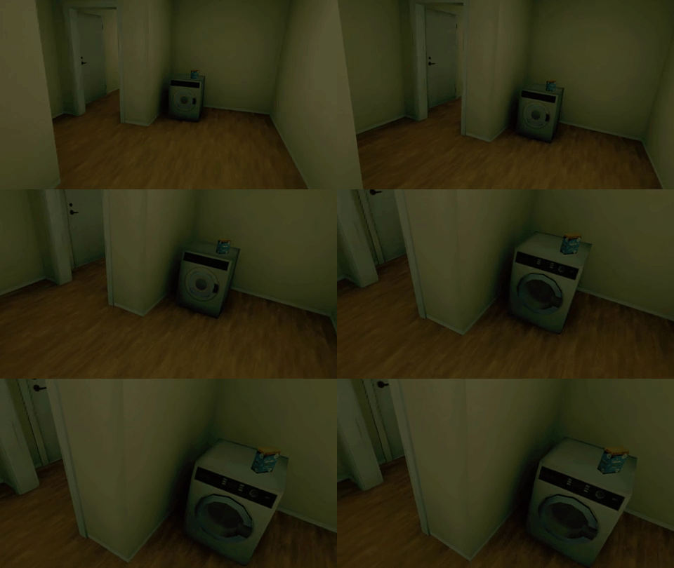
Heading inside, it’s much the same story. You’ll notice a lot of missing items and changed objects, plus the map is missing a bunch of other details like smoke pluming in the distance and even fire effects from one of the houses are completely gone. This washing machine here offers a clear example of the texture pop-in we’re talking about.
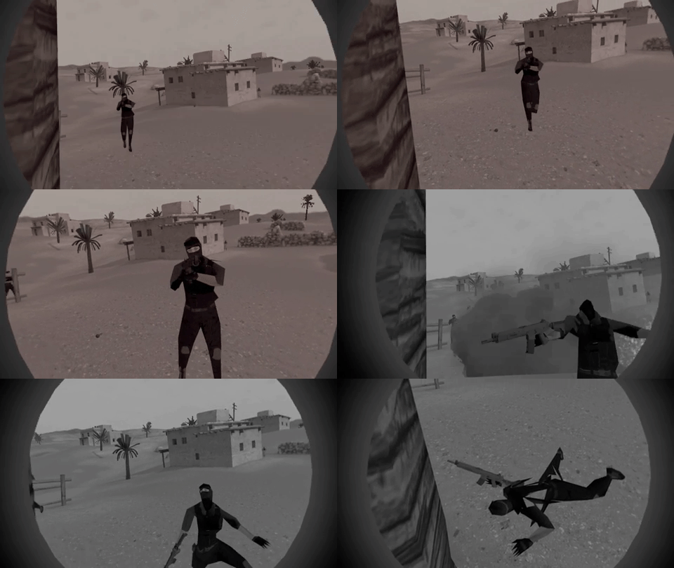
Our other two maps are much the same. Pay close attention to Quarantine, for example, where even some building architecture is radically changed, and there’s a huge difference in lighting contrast, too. On the first floor of the construction site, the ceiling overhead covers a teammate in shadow when there are clearly lots of light sources coming in. We’ll leave you with this particularly damning enemy model which sort of speaks for itself.
Again, even with all these cutbacks, Onward is absolutely playable on Quest and for many hardcore fans these blemishes might not be of much concern. Plus there are incredibly impressive technical accomplishments like getting scopes to work. But you might need to ask yourself how important the presentation aspect of a game is before you pick up this port. If you value that aspect, you might want to hold off on Onward on Quest at this early stage.
What do you make of our Onward graphics comparison? Let us know in the comments below!

![Onward: Oculus Quest vs PC VR Graphics Comparison [PRE 1.8 UPDATE]](/content/images/size/w1024/format/webp/2020/07/Onward-Graphics-Comparison-Avatars-scaled.jpg)


