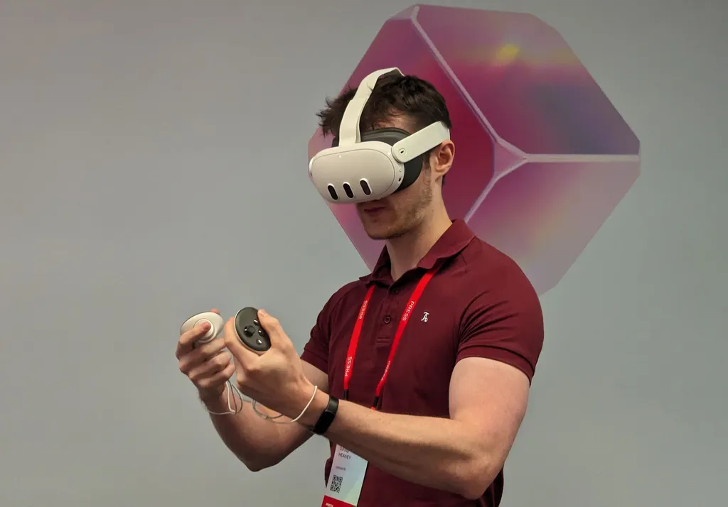
I've been using Quest 3 at home since last week - here's what I think of it in real world use.
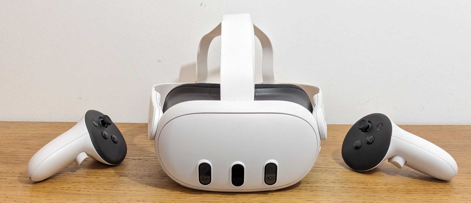
Quest 3 is a significant improvement over its predecessor on paper, with a 40% slimmer visor, pancake lenses, next-generation chipset, color cameras, depth sensor, and more. With its mixed reality capability, it even promises to deliver entirely new kinds of experiences not possible on Quest 2.
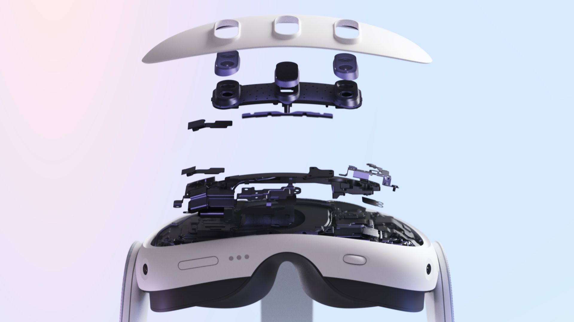
Starting at $500 though it's in a markedly higher price category than its predecessor, which Meta is continuing to sell alongside it. So are Quest 3's upgrades actually worth the $200 extra in practice? Or does Quest 2, which can play all the same VR games, still offer better value?
Comfort & Weight
When I first tried Quest 3 at Connect I was shocked at how comfortable it felt with the default facial interface and strap.
When someone I know got a Quest 2, the first thing I'd tell them is to swap out the facial interface for a third party alternative and get an Elite Strap. I'd describe it as essential, and I consider Quest 2 to be incomplete out of the box.
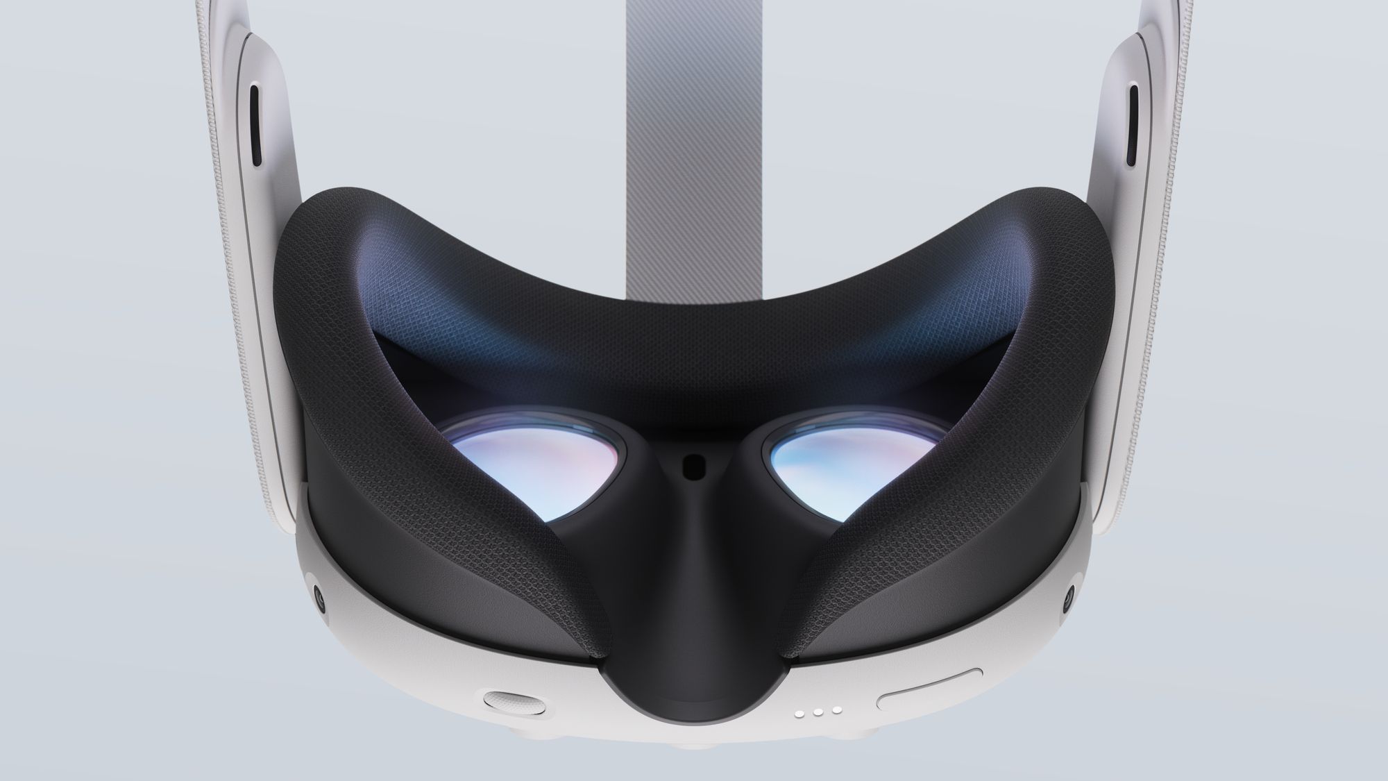
With Quest 3, this is no longer the case. The default facial interface is made of a softer, gentler kind of foam that doesn't hurt my face like the cheap-feeling harsh material of Quest 2's.
The other nice thing about the facial interface is that glasses wearers will no longer need to use a spacer insert, as by just pulling on either side of the facial interface you can adjust the distance from the lenses to your eyes, with four fixed distances possible. I don't wear glasses, so I kept it at the closest setting to maximize the field of view.
It does have a light leaking nose gap at the bottom though, so if you want total immersion you'll want a third party replacement.
But what's more surprising is that I actually find the default cloth strap comfortable, even up to around an hour of continuous use.
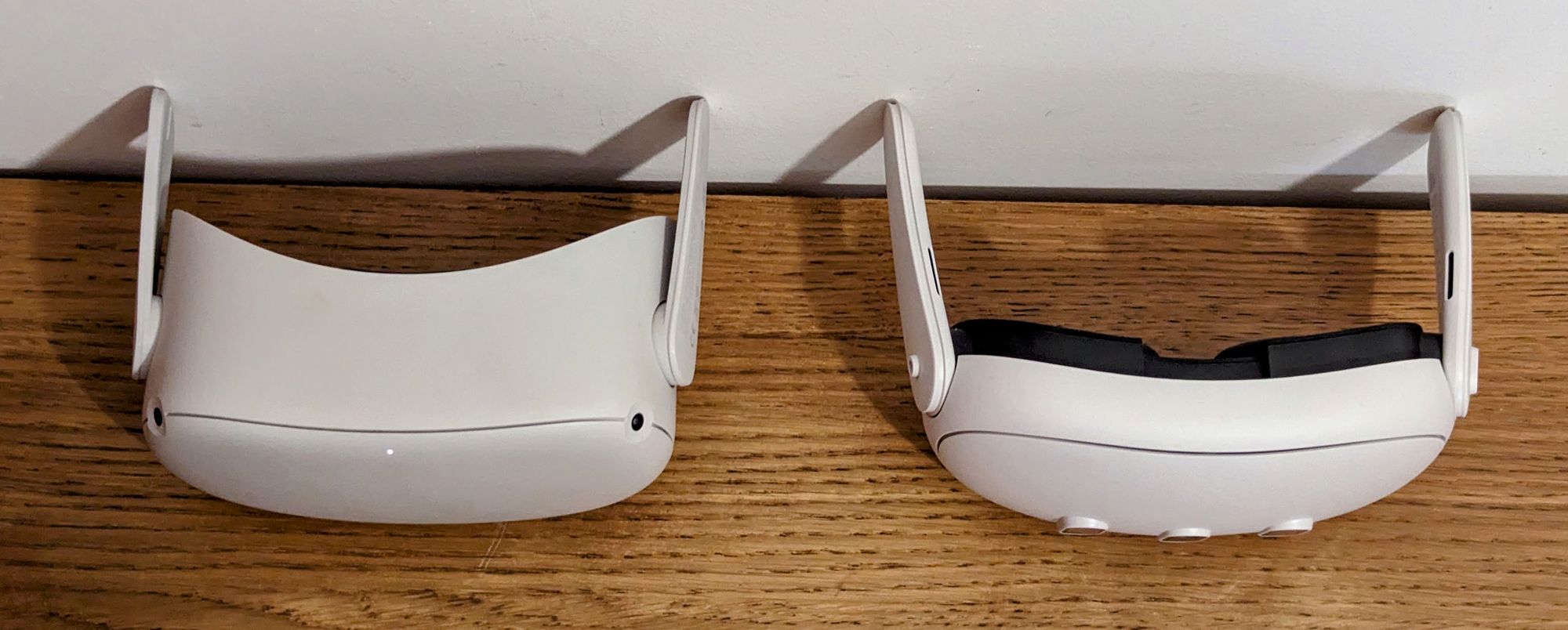
It's been widely reported that Quest 3 is 12 grams heavier than Quest 2, but this raw figure hides the truth. While that's true of the headsets with their straps, with the straps removed Quest 3 actually weighs 4 grams less.
On my face though, it feels much lighter than Quest 2, and I'd argue anyone who wasn't aware of the weight figures would guess it to be significantly lighter. That's because the slimmer design brings the center of mass much closer to your face, exerting far less downwards torque on your neck. The slightly refined strap also seems to make a difference, better distributing the weight, and it feels slightly sturdier.
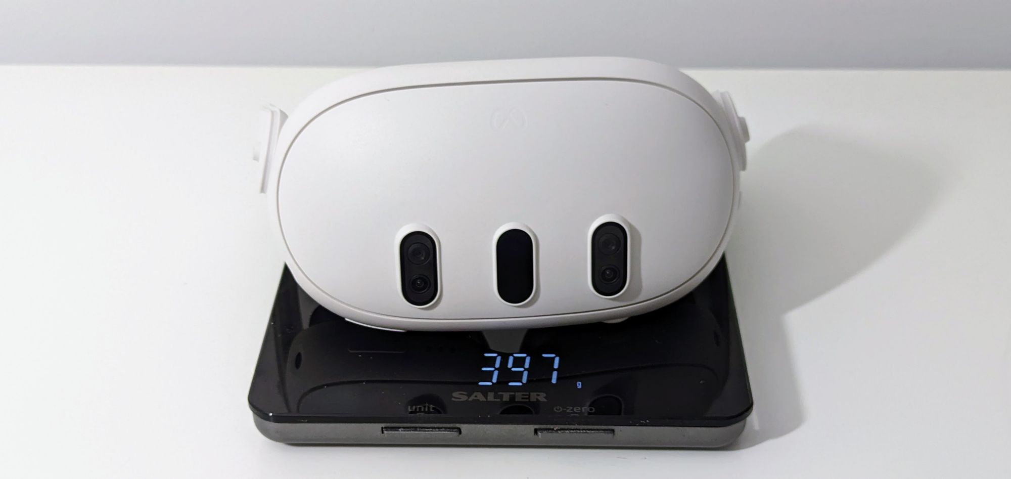
I have ordered an Elite Strap which will arrive later this week. But for now - and I can't believe I'm saying this - the default strap is fine.
As always though, we should note that comfort is subjective, and very much so depends on the size and shape of your head and face.
Pancake Lenses & Dual Displays
What enables Quest 3's slimmer design is the use of pancake lenses, which allow for a much shorter gap between them and the display panels than the fresnel lenses used in headsets like Quest 2, Valve Index and PlayStation VR2.
Pancake lenses have another advantage too though: they provide a sharper and clearer image, especially out to the edges. If you're upgrading from a fresnel lens headset, you'll find the almost total edge-to-edge clarity stunning, and you'll wonder how you ever used VR without it.
They're also far less sensitive to your eyes being properly aligned. When I put on PlayStation VR2 I often spend the first few minutes adjusting to find a balance between comfort and proper optical alignment - but with Quest 3 I simply don't have to think about that anymore. Meta told us this aspect has even been upgraded compared to Quest Pro, with the lenses now having an claimed eyebox of a whopping +/- 5mm.
You should of course still adjust the lenses to align horizontally to the distance between your eyes, your interpupillary distance (IPD). Quest 3 has a stepless scroll wheel for this, supporting precise lens separation between 58mm and 70mm. But I found I still had a clear & sharp image even when my IPD was set completely wrong, which is remarkable.
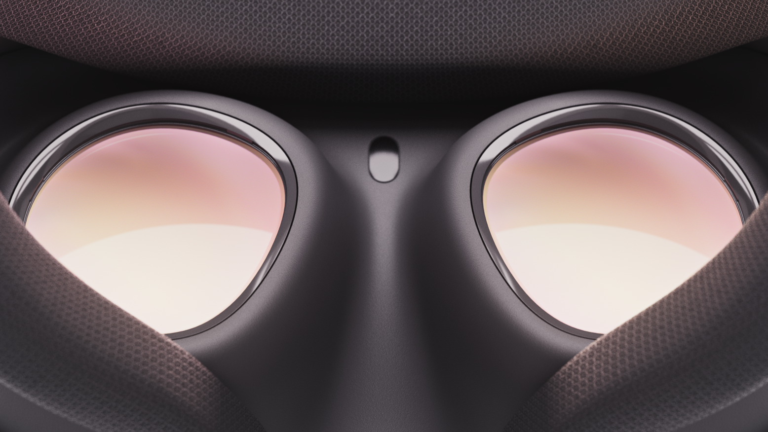
Quest 3 has a noticeably wider field of view than Quest 2 when you adjust the facial interface to the minimum eye relief setting. Field of view is arguably the single biggest driver of immersion in VR, so this is a refreshing and unexpected change, given the years of stagnation on it, and Quest 2 feels somewhat claustrophobic in comparison. Vertically the field of view feels very similar to Quest 2 though. That's both disappointing and ironic, given Meta's CTO said increasing the vertical field of view has more impact than horizontal, and I've found this to be true in my time with Pico 4 and Valve Index.
The horizontal field of view improvement over Quest 2 will feel even more dramatic to people with a wider IPD. Quest 2 uses a single panel, and when the lenses are at their widest separation the field of view is cut off on each side. Quest 3 has a separate panel for each eye, so you'll get a consistent monocular field of view regardless of your IPD.
The displays are also noticeably higher resolution than any previous Meta headset. Meta markets a 30% resolution upgrade over Quest 2, but the difference is much greater in practice because Quest 2's single panel means its lenses view only part of the display at once. The resolution now feels similar to HP Reverb G2, and in titles which take advantage of this by using dynamic resolution with a large maximum value the result can be so sharp it's hard to believe it's fully standalone. In PC VR, with Virtual Desktop or Link, it's even more noticeable and you'll start to see fine details you wouldn't notice before.
The downside to Quest 3's displays is that they're still just regular LCDs, with no local dimming and no quantum dot layer. That means Quest 3's contrast, while 50% improved over Quest 2, is still limited compared to OLED headsets, and it can't display true black - only a murky dark grey. While this doesn't much affect mixed reality play, in VR games with nighttime or dark scenes it noticeably detracts from immersion.
True Color Passthrough
Meta's big selling point for Quest 3, and a focus of much of the marketing so far, is of course its mixed reality capabilities, enabled by its processed camera passthrough.
Quest 3's true color view of the real world is light-years ahead of Quest 2's fuzzy black and white, with 10 times the number of pixels, but it still has major flaws and feels nothing like looking through a transparent optic.
Unlike Quest 2 and Pro, Quest 3's cameras dynamically adjust their exposure so you can use your phone, view your PC monitor, and look out windows without seeing a blown out image. The resolution is just good enough to read text, either on a screen or on paper, and this is useful compared to Quest Pro where it wasn't. But the text isn't nearly as clear or sharp as taking off the headset, so this isn't something you'd want to intentionally do for more than a brief time. There's also a noisy grain on the image, similar to what you'd see in a smartphone camera video.
The other reason you wouldn't want to use your phone in Quest 3 for long is the close range geometric warping. If you hold any object closer to your face than around half a meter you'll see it significantly distorted, and this hurts your eyes to look at. This leaves you in a conundrum where you either hold your phone too far away for the smallest text to be legible or so close that it no longer even looks rectangular.
The warping and ghosting looks even worse in the headset than in a recording.
The final issue with Quest 3's passthrough, also only at short range, is ghosting. You'll see double-imaging on moving objects nearby, which unfortunately includes your hands. It's more subtle than it was on Quest Pro, where color also lagged behind greyscale, but it still makes using hand tracking in mixed reality unpleasant.
All of these issues emerge from Meta's heavy image processing reprojection approach, but this also brings significant advantages over other the passthrough on current competing headsets. Quest 3's passthrough is depth-correct with extremely low latency, and the scale is essentially perfect for objects not close to your face. You can lift up the headset and see your furniture at the exact same scale, size, and apparent distance you were seeing it in passthrough, and the world doesn't appear to skew when you walk around. Whereas spending more than a few seconds in the passthrough of Pico 4 or Vive XR Elite makes me feel queasy because they lack these qualities, I was able to comfortably spend over an hour in Quest 3's.
Combined with the essentially perfect positional tracking, the low passthrough latency means virtual objects look truly anchored to your real environment without the jittering, drifting, or floating you sometimes see with phone-based AR.
Mixed Reality
To play mixed reality experiences within this real world passthrough view, you first need to let the headset scan your room. As you pan around your room you'll see a mesh starting to appear on your floor, walls, ceiling, and furniture, and virtual objects will be able to collide with, emerge from, or appear behind them. After around 10-20 seconds the generated mesh will be ready to use.
This automated process, enabled by the depth projector, is a significant improvement over the painfully slow mixed reality room setup on Quest 2 and Pro, which had you arduously manually mark out all your walls. Mixed reality was possible on those previous headsets yes, but on Quest 3 it's finally practical.
The manual setup process also only supported rectangular cuboids, so couldn't accurately incorporate most furniture. Quest 3's automated scanning picks up arbitrary shapes, so virtual objects exist in your space much more realistically. However, the cell resolution is still on the order of 5-10 centimeters, so it won't pick up the smallest objects and the mesh of even medium sized objects isn't fully accurate. It also struggles with transparency - the glass table in my living room for example wouldn't scan so I had to mark it manually, and windows can also throw it off.
Annoyingly though, the headset can only remember one mixed reality room at a time. Meta tells us it plans to add support for multiple in a future software update.
It's incredibly cool to see virtual enemies climb through holes in your wall, for objects to bounce off your couch, or for shell casings you've fired to land on a nearby table. It's an open debate as to whether this kind of mixed reality can offer lasting engagement or is just a short term gimmick though. I'm excited to see what developers do with it in coming years, and suspect they may prove naysayers wrong.
The sorely missing thing in mixed reality on Quest 3 though is dynamic occlusion. Virtual objects can appear behind the scanned mesh, but not behind moving objects. Your hands, arms, and other people always appear behind virtual objects regardless of their position, with the virtual objects rendered on top, even if they should be far away. This is jarring, looks terrible, and is frankly embarrassing for a headset marketed for mixed reality.
Meta says dynamic occlusion is coming in a software update later this year though, but developers will need to release updates to integrate it into their apps.
There's something else that struck me about mixed reality on Quest 3 though. Multiple demos, including the default First Encounters experience, make your real walls destructible so that shooting them reveals a virtual world behind them. But that virtual world looks so sharp, clear, and vibrant compared to the passthrough view that I found myself regularly shooting out my walls on purpose just to reveal it.
A more minor problem is that Meta still hasn't fully converted its system software to support mixed reality. App permission requests still take you to a VR void and show you a giant far off prompt for example, and the shutdown and restart notices do too. Many mixed reality app loading screens also replace passthrough with a black screen, which feels unpolished.
VR Gaming & Performance
Quest 3's new Snapdragon XR2 Gen 2 chipset offers an enormous upgrade over all other previous standalone headsets, with more than double the GPU performance.
Red Matter 2's developer increased the rendering resolution from a fixed 1226×1440 to a dynamic 3322×3519, replaced 1K textures with 4K textures, and added dynamic shadows with high-quality shadow filtering to grabbable objects, and many other developers will be releasing Quest 3 upgrade patches in the coming days, weeks, and months.
The result is graphics that feel more like what I'm used to on PlayStation VR2 than on Quest 2, which is a remarkable achievement for a fully standalone headset. The hardware is finally capable of delivering an experience where I expect core gamers will no longer think "this is great fun, but the graphics suck".
The difference in what developers can achieve on Quest 3 is so extreme I'd argue the new chipset is the single biggest hardware upgrade. Meta is mainly marketing Quest 3 as the "first mainstream mixed reality headset" - but this hides the fact that it's mainly an excellent VR headset.
Even games without upgrade patches will look better thanks to Quest 3's automatically higher rendering resolution. While they still have mobile quality assets, they no longer have the constant distracting shimmering and aliasing typical of gaming on standalone headsets, and text in menus and other UI is sharp and clear.
The other advantage of the more powerful chipset is that the system interface is no longer laggy when you bring it up inside apps, a problem I harshly criticized Quest Pro for. Multitasking is now practical, so you can quickly pull up the browser to look something up or check a web-based messaging platform.
The Safety Boundary
Arguably the most annoying part of using a standalone headset is the need to manually paint out a safety boundary just to jump in and the restrictiveness it imposes.
When you put on Quest 3 you'll see passthrough by default, and passthrough no longer requires drawing a boundary. You can use the interface or jump into some mixed reality apps without making or using a boundary, though others seem to still require it. It's unclear what exactly differentiates these.
When you do need a boundary though, such as for playing a VR game or just being in your virtual home environment, the same depth projector that powers the mixed reality room setup can also now suggest a boundary, as PlayStation VR 2 does. That boundary is often conservative though, so you'll often need to edit it. But it's still faster than doing it fully manually, and even more importantly: unlike Quest 2, I haven't experienced Quest 3 forgetting my boundary at all yet, likely thanks to its higher resolution cameras and depth projector.
However, I don't really understand why Meta is keeping the traditional boundary for Quest 3 at all. It limits you to using VR only within completely empty spaces with no furniture of any height, even if you could reach over it. Setup videos discovered in the firmware back in June seemed to suggest that Quest 3 would let you simply use the generated 3D room mesh instead of the crude infinite-height boundary, and I would far prefer this, at least as an option. We'd be able to leverage more of the room for your hands in VR, including the space above beds and tables. At Connect Meta engineers suggested that this idea is being explored, but that there are safety concerns to think through.
Touch Plus Controllers & Hand Tracking
The new Touch Plus controllers feel great in your hand, with the lack of tracking ring giving them an ideal weight distribution.
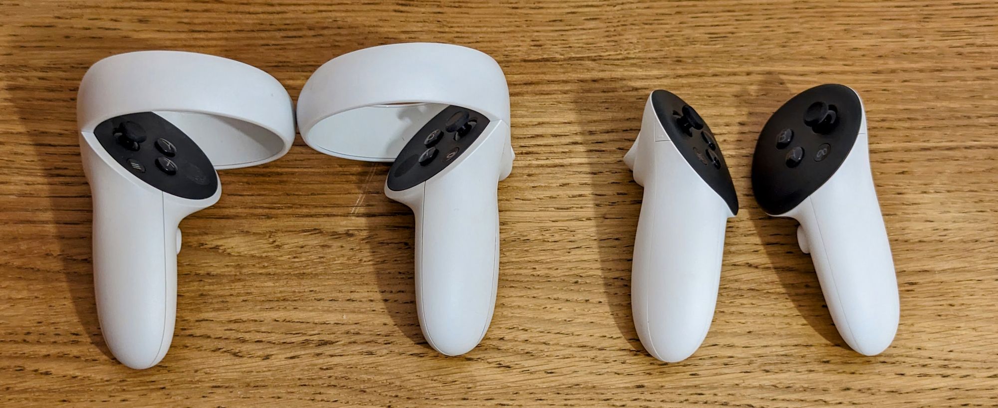
Like the much more expensive Touch Pro controllers, the advantage of the ringless design is that you can bring them much closer together at any angle since you’re no longer at risk of bashing plastic. That may sound unimportant, but it actually makes precise hand-to-hand interactions such as reloading a rifle feel much less janky and opens up new kinds of interactions too.
Some people had speculated that moving the infrared LEDs tracked by the headset to the face of the controllers instead of on rings would compromise the tracking quality, but I've found it to feel essentially identical to Quest 2, with one exception. The differences in headset camera placement mean the controller tracking range is now much wider horizontally to each side, but narrower vertically above you.
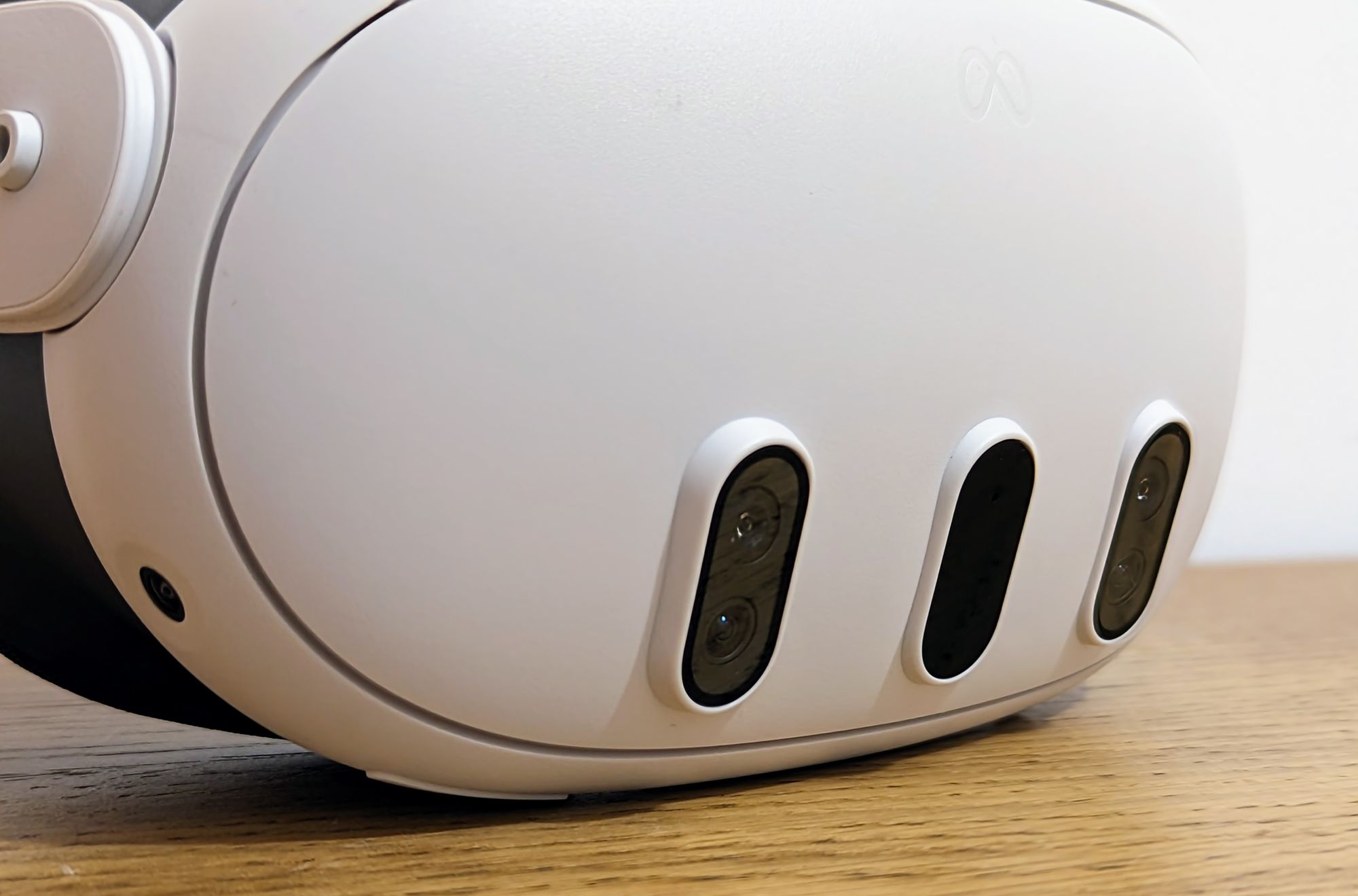
The haptic system in the controllers is much improved over Quest 2. Touch Plus uses a voice coil modulator (VCM) instead of a linear resonant actuator (LRA), which provides a more realistic and precise feeling haptic effect and a broader frequency range. Unlike Touch Pro controllers there is only one haptic actuator, not also two other separate ones for the index finger and thumb. That was expected given Touch Pro costs $300, though.
Controller-free hand tracking is noticeably improved, supporting a wider variety of lighting conditions - including, surprisingly, in almost total darkness, as does the headset tracking too. This is a stark contrast to PlayStation VR2 where in anything but a bright room I experience tracking issues.
Conclusion & Recommendation
Quest 3 truly feels like a generational leap over Quest 2. Its state of the art lenses offer stunning sharpness and clarity, it's comfortable to wear, and its new chipset is capable of elevating the standalone VR experience from mobile-feeling to console-feeling graphics that finally feel ready for mass market gamers.
But the mixed reality is first generation, and while I'm sure some early adopters will have great fun with it, I'm skeptical that it will live up to the expectations of the wider market, especially once Apple starts offering Vision Pro demos in its stores.
If you're looking to buy your first VR headset or upgrade from any existing one, I fully recommend Quest 3. It's worth the price and you won't be disappointed. But if it's mainly mixed reality you're interested in, be aware that the technology behind it and content for it are still in their earliest days.

