VR hardware prices are decreasing. New premium headsets are entering the market. 6DOF mobile is making its way to consumers. 2017 is laying the foundation for a VR content explosion that will usher in a new wave of VR developers.
Creating for a new medium, which is still in the midst of discovering itself, can be challenging. Luckily, we have history to help guide us. Designers and theorists like Marshall McLuhan, Jony Ive, and Raymond Loewy had to innovate within new mediums. We can use their experience to inform today’s virtual reality design process.
If you are thinking about joining the VR crusade, these three lessons, inspired by history’s greats, will help save you time and fine tune your thinking. Consider these early (and often) before opening your VR engine of choice.
Lesson 1 – The Message of the Medium
“New media may at first appear as mere codes of transmission for older achievement and established patterns of thought.” – Marshall McLuhan, 1960
In the early days of cinema, budding filmmakers would simply film radio dramas. They used the “known” (radio) and overlaid it with a new technology. This holds with every medium since the invention of language. As the original media theorist Marshall McLuhan explained, any new medium starts with old functions but evolves into an entirely new form. “Printing made literature possible. It did not merely encode literature.”
VR content is in a similar phase today. It’s obvious to take an existing game genre (like a first person shooter), put it in VR, tweak a few things, and call it something new.
To avoid simply using VR for VR’s sake, look at the fundamentals of what you are creating to determine if it really warrants VR.
It’s certainly easier to NOT develop in VR; wider audience, easier development, more forgiving performance requirements. If you are going to go down this path, make sure you start with something that can only exist within virtual reality.
Force yourself and your team to ask “Why does this belong in VR?”. You’ll either realize the experience doesn’t belong in VR, or you’ll discover ways to further enhance the VR experience. As McLuhan said “It is the framework which changes with each new technology and not just the picture within the frame.”
Lesson 2 – New, but Familiar
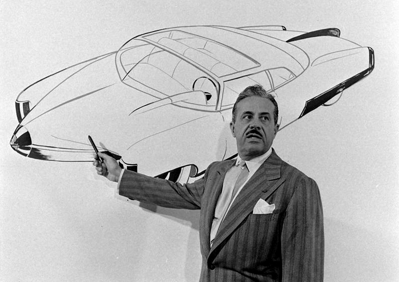
Raymond Loewy was behind the logos for companies like Shell Oil and Air Force One. He also designed cars, buses, and even the space station. Everything Loewy created was at the edge of normal to the 1960s public. This was very much intentional.
Loewy’s foundational design concept is abbreviated MAYA – Most Advanced Yet Acceptable. Humans crave the familiar, but also want something new. With MAYA Loewy aimed to balance these competing desires and push technology boundaries right up to the edge of what society could accept. MAYA allows for evolution without consumer abandonment.
The Apple Newton was far too advanced and thus unacceptable. Consumers needed the iPod and then an iPhone before being able to accept the iPad. The same applies with virtual reality content.
As a VR developer, you need to understand the technological edge of today’s audience. Then, have a vision for where you want it to go. While many in the VR industry want a Snow Crash or Ready Player One metaverse today, the rest of society is a decade away from being able to accept that. Instead, creators need to bring the audience to the technological edge with each release. The metaverse will emerge, as if it had been inevitable, from these gradual evolutions.
Lesson 3 – Create Comfort, then Move On
Skeuomorphic is a design term, often used to describe user interfaces, in which a digital object represents its real world counterpart.
Apple famously used a skeuomorphic design in its iPhone operating systems until the release of iOS 7 in 2013. Before that, everything that could be skeuomorphic was; The Notes application looked like a notepad. iBooks looked like a bookshelf. Game Center looked like a billiards table.

Apple helped consumers get comfortable with touch screen phones by providing a direct correlation to an application’s real world counterpart. MAYA at work.
In VR, the skeuomorphic concept can be taken further to include skeuomorphic interaction. Players are delighted when their virtual interaction behaves as it would in the real world – be it a bow and arrow or coffee cup. When objects function in VR as they do in the real world the player becomes more immersed.

Job Simulator is the king of skeuomorphic interaction. Nearly every object functions as you would expect, from computer to coffee cup. The company famously spent over 800 hours just on their liquid subsystems.
As you develop for VR, which objects should you bring to life?
Apple abandoned their skeuomorphic design because “People had already become comfortable with touching glass, they didn’t need physical buttons [anymore],” said Jony Ive in a USA Today interview. Similarly, certain interactions in VR may only be needed temporarily. Manually unloading the clip of a gun, grabbing a new clip, then loading it back into the gun is a slow and imprecise way to reload. Audiences may tire of such mechanics as the desire for deep interaction grows more sophisticated.
History shows that VR will unlock as something completely different than cinema or video games. VR creators and audiences will move past the ‘filming a radio show’ stage, but VR’s final form is still up for debate. The chance to shape a new medium happens once per generation, and thanks to the thinkers and creators of the past, this process will occur faster than it ever has before.
Nick Robinson is co-founder of the VR Studio RLTY CHK. Follow him on Instagram and Twitter.


