With the release of the entire Star Wars: Vader Immortal trilogy on PSVR this week we jumped into a full Vader Immortal graphics comparison of the first 15 minutes of Episode I.
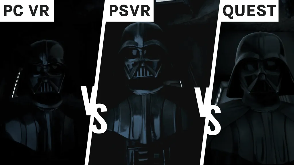
Below you can see how Vader Immortal holds up on PC VR, PSVR and Quest, side-by-side. As always, PC VR will be held as the high-bar with Quest and PSVR varying greatly. The main question is: does the PSVR version beat Quest?
Character Models
As you watch through the graphics comparison above you’ll find that each character has been optimised – or, well, visually downgraded – in their own ways.
Lots of ZO-E3’s details get lost in the PSVR port, with Quest holding its place about half-way between that and the PC VR version. It always feels like there’s some mist on your glasses when you’re looking at her – and that rings true with most high-detailed robotic objects. Her character model seems a bit altered, too, which makes her look a little longer than in the PC VR version. This could also just be the angle we’re look at her from, though.
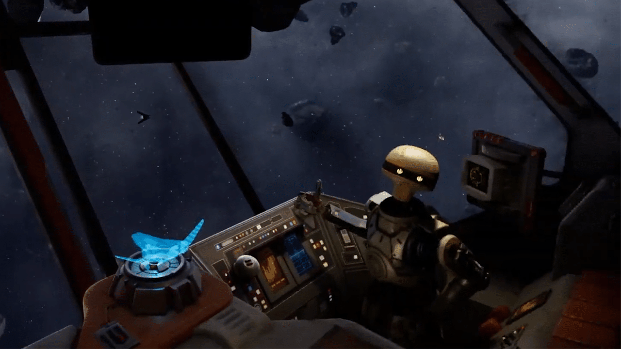
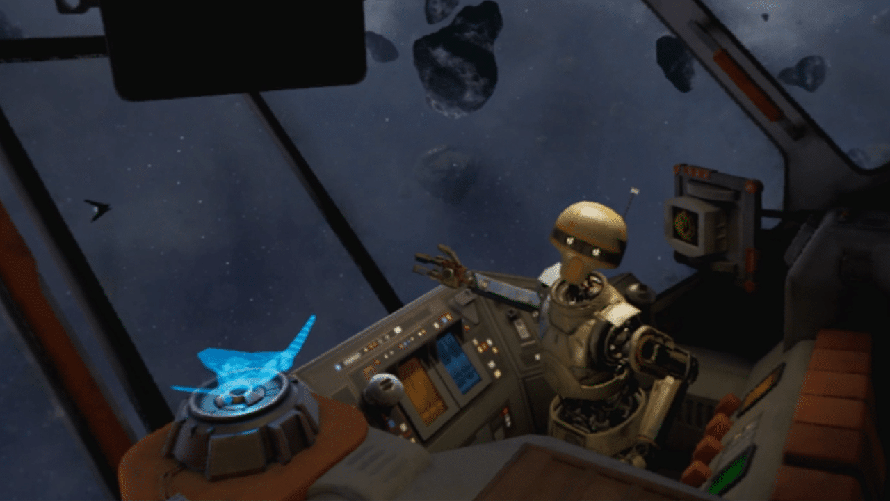
However, looking at Vader, he surprisingly looks the best and most pronounced in the PSVR version compared to both PC and Quest. His suit is a lot shiner, picking up more detail, and it certainly helps when most of his scenes are in moody, dark settings which gives it a real cinematic flair.
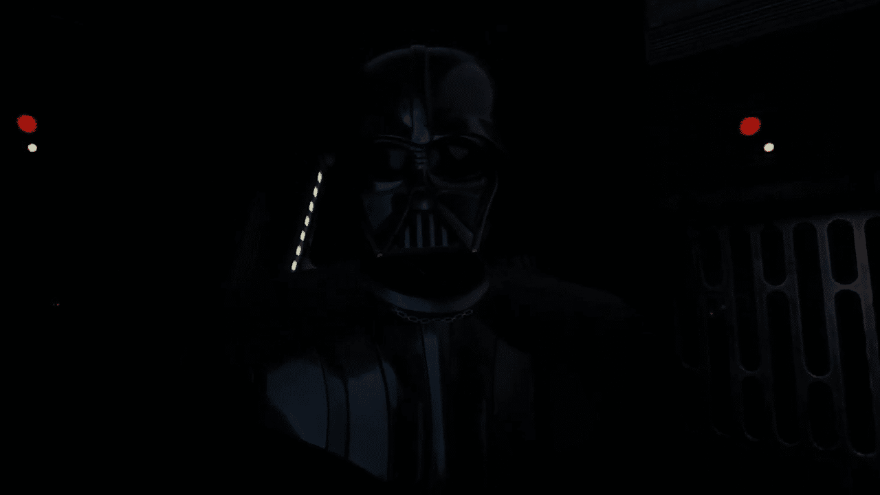
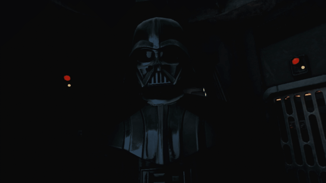
We can’t quite put our finger on it, but it almost definitely seems like the PSVR Vader is a better, improved character model compared to its previous versions. On Quest his suit looks matte, and on PC VR he almost blends into the background.
We get a good look at Admiral Karius before we meet Vader for the first time and unfortunately he didn’t get the same treatment as Vader. He looks a lot more like a Half-Life 2 character on PSVR with his relatively low-poly facial details and clothes. Look closely at the button on his hat and his one-sided collar – there’s very little definition here and it is certainly noticeable. However, on Quest, his wrinkles and scars hardly show up at all while details on his badge look almost clumsily outlined.
Lighting
This is the make or break element of VR ports, because with some it doesn’t matter how much detail you’ve left in, if the lighting isn’t right then it all goes ignored.
With the PSVR version in comparison to PC VR, I’m really happy to see that the lighting is in fact better. This brings us back how impressive Vader looks, and it has to be down to the better overall lighting. It also helps to be able to actually see what’s going on in the darker scenes. Only when you compare them side-by-side (such as the ZO-E3 image above) can you notice there might be some
When we take a look at the Quest version, everything looks a bit flat and basic, with little depth in comparison to its PC and PSVR versions. In addition, it’s great to see that they’re so conscious about saving energy with much dimmer lights on things such as switches and buttons. Vader isn’t so bad after all.
Environments
This is where PSVR excels in comparison to Quest. When we overlook Mustafar as we’re dragged out of hyperspace, there’s little difference between the colour and detail of PC and PSVR. Quest, however – yeesh. It looks more like the planet of Flamin’ Hot Cheetos.
At the end of our graphics comparison when we finally reach outside with ZO-E3, Quest remains strangely saturated still, giving off a totally different vibe and atmosphere compared to PC and PSVR.
As we arrive on Mustafar, there seems to be differences between how many active Stormtroopers there are greeting you. There’s a stark contrast between the Stormtroopers and the hazy, dark hangar on PC VR, however there just doesn’t seem to be as much going on in both the PSVR and Quest versions. They look almost empty in comparison.
Walking around the ships throughout the beginning sequence, we could spot little difference between each of the versions until we came across the more interactive elements. When checking over the hologram of our ship for damage, you can see that the PSVR and PC VR versions are almost identical with PSVR losing just a few lines here and there. However, Quest has had a complete remodel with a blockier, more opaque body and far fewer details. The same goes for the few artefacts, buttons and handles you can pick up and interact with.
Overall Performance
PSVR absolutely beats the Quest version, and even excels past PC VR on a couple points. The only issues that hold this port back from being the best there is lies beyond visuals and more in its adapted design. Why aren’t my hands straight and lightsaber straight? Why can’t I just walk like in the PC VR and Quest versions? Why isn’t the Dojo a 360 experience anymore? Rest assured you won’t be as disappointed with the visuals.

